Color being subjective. I believe Walthers came a tiny bit closer to the Tuscan of the era, which was “reder” but the Rapido is good, too. If nit-picking, the gold pin stripe should be on the tip of the flute rather than in the valley. Like I said, nit picking [;)]
I hear the Budd sales people had tried to convince the Pennsy purchasing agents that painting the stainless steel was not necessary, and PRR finally caught on but not for a few years [:-^]
The car body was the same “Tuscan Red” as the remainder of the “fleet”. The band was darker Tuscan #70-19 or PRR Maroon #47-2249.
Lettering was going through various changes in materials from gold leaf to DuPont gold pigmented lacquer to Pullman Imitation Gold #600-9 throughout years 1938 through 1953.
Even the above drawing is a simplification of the original plan. A 1/4 " gold stripe has been eliminated at the drip rail and the 1/8 black outline has been removed from the 5/8" window band stripe and the lettering outline.
Bruce Smith at Auburn, who is probably as close to a ‘definitive reference’ to PRR paint details as we have, noted as late as the end of 2019 that PRR never used ‘Bronze Gold’ for lettering, even as a euphemism for gold leaf. (A conclusion which logically follows is that decals using ‘bronze gold’ for PRR lettering - and there are many - are inaccurate. I have no credentials to judge whether that is so or not.)
On the other hand, 3768 when streamlined in 1936 was initially painted a ‘dark bronze’ color (which I remember being discussed as being a kind of early metalflake paint in appearance).
I am loving gmpullman’s detailing pics. Very nicely done. Although few of us have $6k to spend on some passenger cars I do like to log in at the brass guide section of brasstrains.com and ogle their detailed pics of complete train specific Fleet of Modernism consists. It’s my favourite of all the paint schemes and I do find the betterment cars very interesting. Can’t see us ever getting a decent set in plastic for the Spirit of St Louis or Southwind, but I live in hope.
If the Bachmann observation car was skirted I would get one for sure but I am piled high with passenger trains for now.
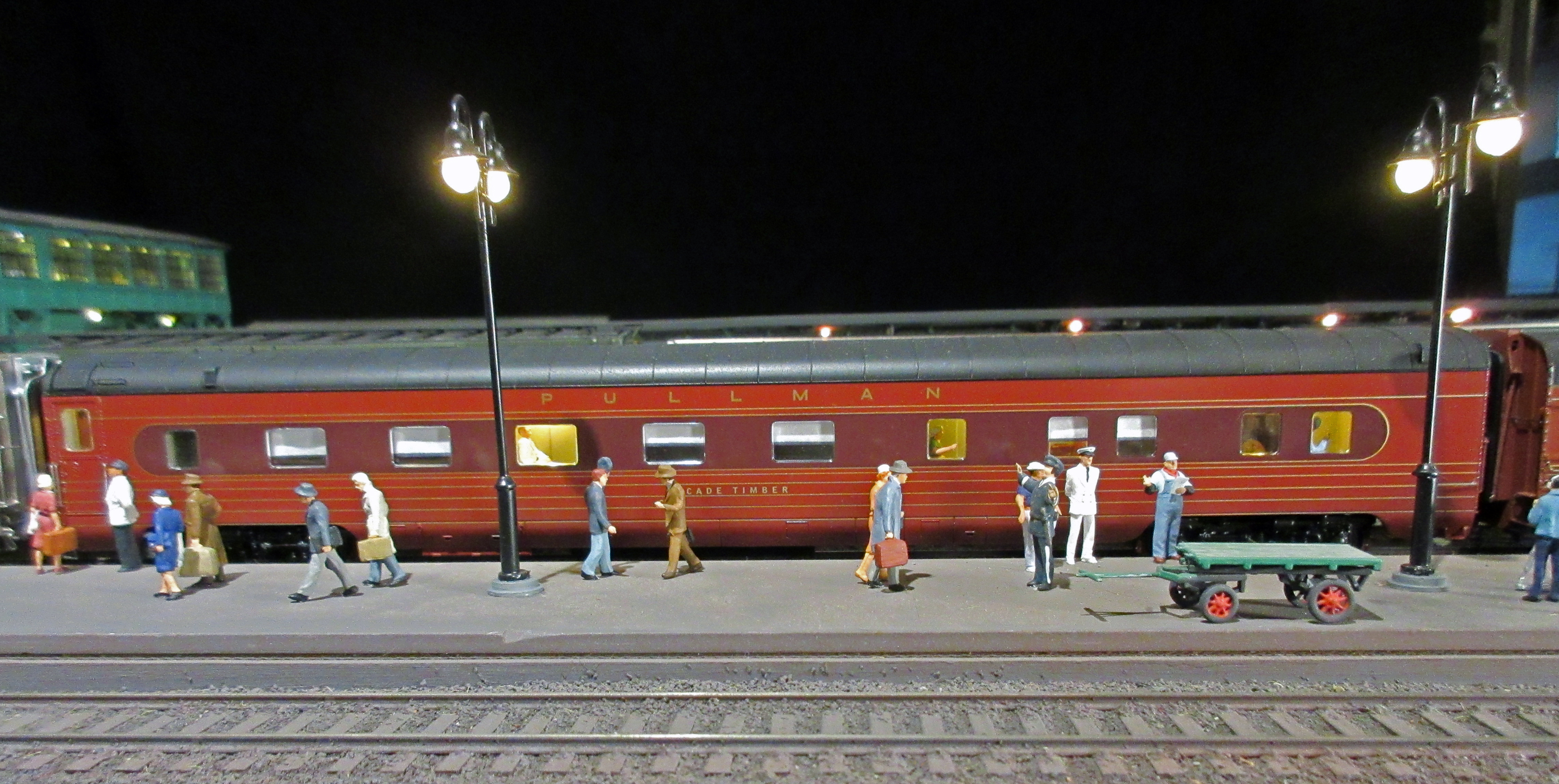 PRR_FOM_Pullman-broadside by Edmund, on Flickr
 PRR_FOM_Pullman by Edmund, on Flickr
 PRR_Budd_Tuscan by Edmund, on Flickr
 PRR_FOM_Tuscan by Edmund, on Flickr