I copied the text and photo of this post a couple years ago with the intent of using your methods when I finally got to completing my own backdrop. I can now report that your guidance was right-on.
I am not ‘artistic’ and am naturally drawn to model railroading for the technical aspects (electrical and mechanical) thus tend to shy away from (avoid) scenic work at all costs. But the excuses finally ran out and I was left with blank sheets of styrene as backdrops. So with your article and photo in hand I trudged to the paint store, procured the necessary supplies, screwed my courage to the sticking place and jumped in to paint about 60’ of backdrop.
The results exceed my expectations! It looks like sky!
Thank you for sharing your experience in simple easy to understand (electrical engineering) terms.
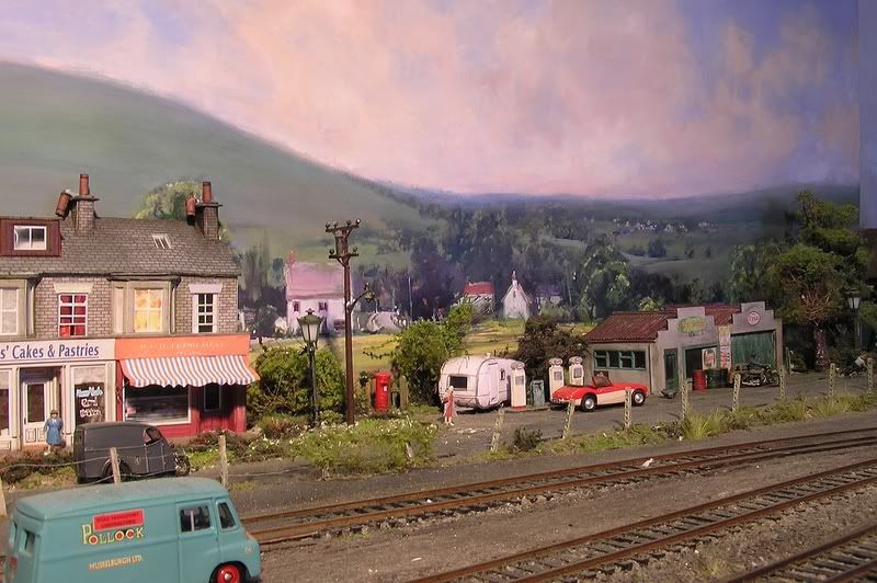
My AVATAR shows how I achieved forced perspective. I used SceniKing 7"x11" for my continuous panorama around the walls of my 24’x24’. Note that I have an N scale train track on a 2"x2" rough gray wooden riser behind my HO scale track that is directly in front of it. This set-up gives me a very realistic backdrop. Another idea is to use layered cutouts of conifer trees on narrow ridges. It appears as vast canopy of trees that is actually only less than an inch deep. Bob Hahn
You don’t really have to be an ‘artist’. A simple sky blue backdrop looks a lot better than no backdrop. I use sheet styrene, it’s pretty easy to use and to curve around corners. To do clouds, I use a spray can of white Floquil or Testors paint and sort of ‘puff-puff-puff’ clouds on. (Acrylic paint won’t work, it runs too easily.) For distant hills, I cut out hills from grassmats. I used a spray can to paint the more distant ones with a dusting of gray paint.
The two biggest mistakes I see people make when painting a backdrop are the cartoon-ish clouds and using colors that do not match the layout. A few light, wispy clouds are all that are needed in a sky, and if your scenery is say, olive or dark green, don’t paint your backdrop scenery bright green. Match the backdrop colors to your layout’s scenery.
Camel hump mountains are another faux pas that make me cringe. Make them gently sloping instead of pyramid-shaped.
Good points, Jumijo. And when seen from an angle, mountains will compress into even more humped shapes, so starting with gently sloping examples is a good move.
Buildings are another problem. I paint mine “flat-on”, avoiding perspective lines as much as possible.
 Bob Hahn