.
This is the color formula I use on all my “black” models. I first saw it in a Paint Shop article in Model Railroader decades ago.
.
4 Parts Black
1 Part White
1 Part Red
.
I have loved the results.
.

.
-Kevin
.
.
This is the color formula I use on all my “black” models. I first saw it in a Paint Shop article in Model Railroader decades ago.
.
4 Parts Black
1 Part White
1 Part Red
.
I have loved the results.
.
.
-Kevin
.
Here’s the real PRR I grew up around and would work for… I was but,a young lad when I took these photos.


I like to refer to this site by renown photographer John Dziobko who has quite a few decent-quality color photos of the Pennsy here:
http://www.godfatherrails.com/photos/pbr.asp?Road=PRR
For example — GP7 fairly clean:
http://www.godfatherrails.com/photos/pv.asp?pid=1921
GP7 fairly “aged”:
http://www.godfatherrails.com/photos/pv.asp?pid=1995
You decide…
As others have mentioned, the perception of color is very subjective. Age, weathering and paint formulations cause a great deal of variation. Add to that color shifts induced by film and processing and age of the photo, time of day, sunlight and weather conditions and you have a real challange to determine the “actual” color.
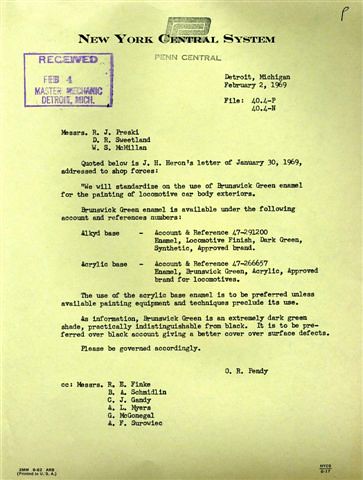 PC_2-2-69 by Edmund, on Flickr
Articles I’ve read about the PRR procurement of paints often cite variations from manufacturer to manufacturer, some shops blending their own paint on-site and even variations caused by the equipment used for application.
One photo I recall seeing was of a brand new EMD locomotive spotted close to a new GE locomotive and there was a distinct difference in color. They even had two different “Keystone” emblems applied, one in Toludine red background with white and the other with yellow lettering.
Broadway Limited works closely with the PRRT&HS to get details and painting accurate however, variances do slip by. My S2 Turbine looks more like the “mossy green” and the other I1sa locomotives in this picture are closer to the dark green:
I suspect the Geep in the funny green costume was intended to better show the detail on this loco. It’s very difficult to get this sort of contrast without lightening up things more generally. Whether Photoshopped (most likely) or a one-off repaint, that and the combination with the need for adjustments and corrections in the printing process can lead to these sorts of concerns. I suspect inspection of the finished model will reflect the fact this isn’t the first Pennsy DGLE loco they’ve painted.
Ed’s point about variations in the color of new PA is well-taken, as this is not as exact a science for most roads nt
Yes, it would be nice if the ad’s color rendering was somewhat more accurate to fhe discerning eye. I rather doubt it’s as far off as it seems here, though the coloration in that image does raise that concern.
If you want a cheap and accessible sub for DGLE, consider Rust-Oleum 214086, Charleston Green. Very dark, but still clearly green - in the right light. [;)]
Take a look at the ties on the track in the two photos. The ties the walthers model is sitting on are pretty washed out (cant tell if they are black or brown). Also notice the lack of shadows, ergo the photo was overexposed or too much light…or whatever…Its probably the photo.
Yes, if you look at the Bachmann FA picture, everything in the picture (trucks, track etc.) are darker. Note too that on the Walthers GP the truck sideframes, which are also painted green, appear darker than the engine because they’re in shadow. The rear truck almost appears black.
If you look at the entire picture in the July-August Flyer (pages 2-3) you’ll notice that the engine is pushing a Walthers Jordan Spreader, which appears to be painted flat black. There seems to me to be stronger light on that side of the picture, probably to try to show the details on the Spreader. The reefer cars behind the engine seem a bit lighter or washed out too.
Like I said, I think you’d have to wait and see one in person to judge how accurate it is.
If I remember correctly the running gear below the belt line, including the trucks, on all these PRR first-generation engines was painted black (not Brunswick/DGLE of any formulation, alkyd or acrylic). It will be hours to days before I can confirm this with volume and page references, but I think it is clearly borne out in many photographs.
You are correct, sir:
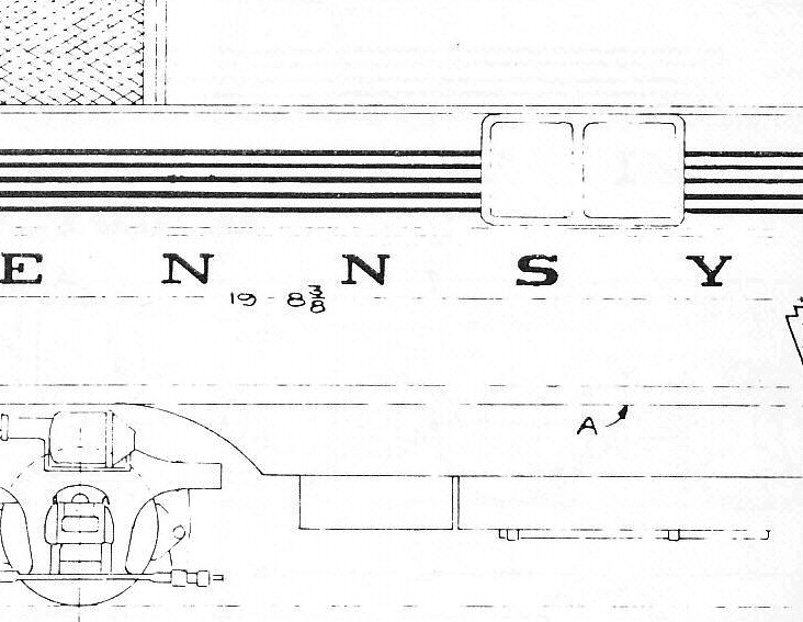 PRR_paint_line_A by Edmund, on Flickr
Line “A”
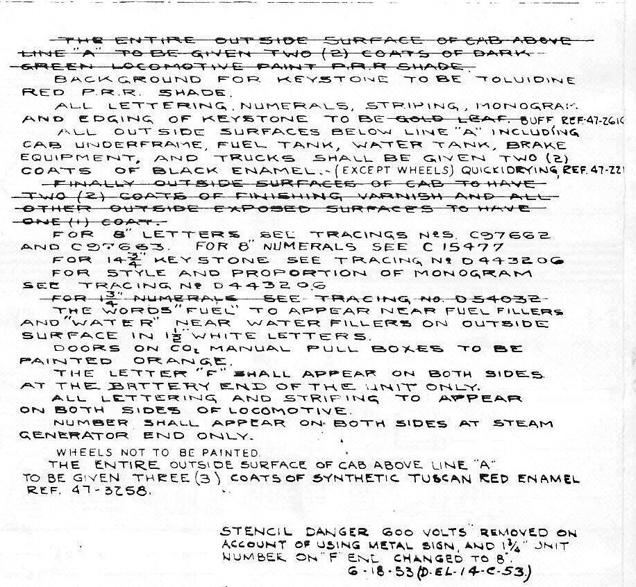 PRR_paint_instruction by Edmund, on Flickr
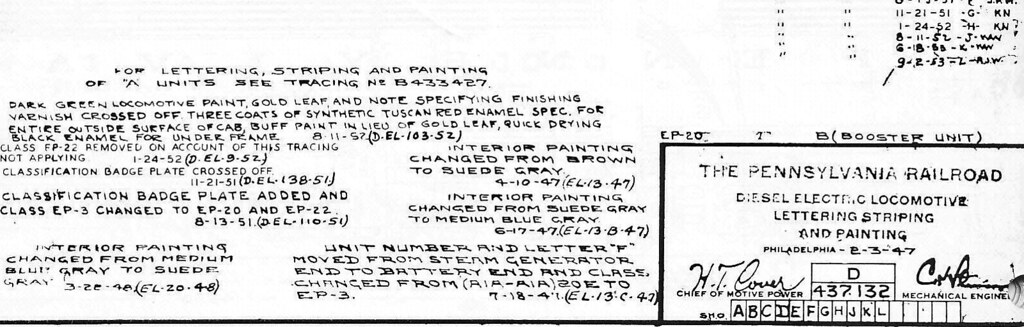
You can read in the notes that when the striping was no longer gold leaf but dulux gold paint, there was another change which ended the practice of applying two coats of clear varnish. This would certainly affect the appearance, especially after months of hard use and repeated washings.
This happens to be the only print I can find at the moment. It is the EMD E7.
Somewhere around here I have some GP-7 & 9 prints.
 PRR_paint_A_edited-1 by Edmund, on Flickr
For you detail-oriented modelers, be sure to have accurate line spacing at the point of the five stripes!
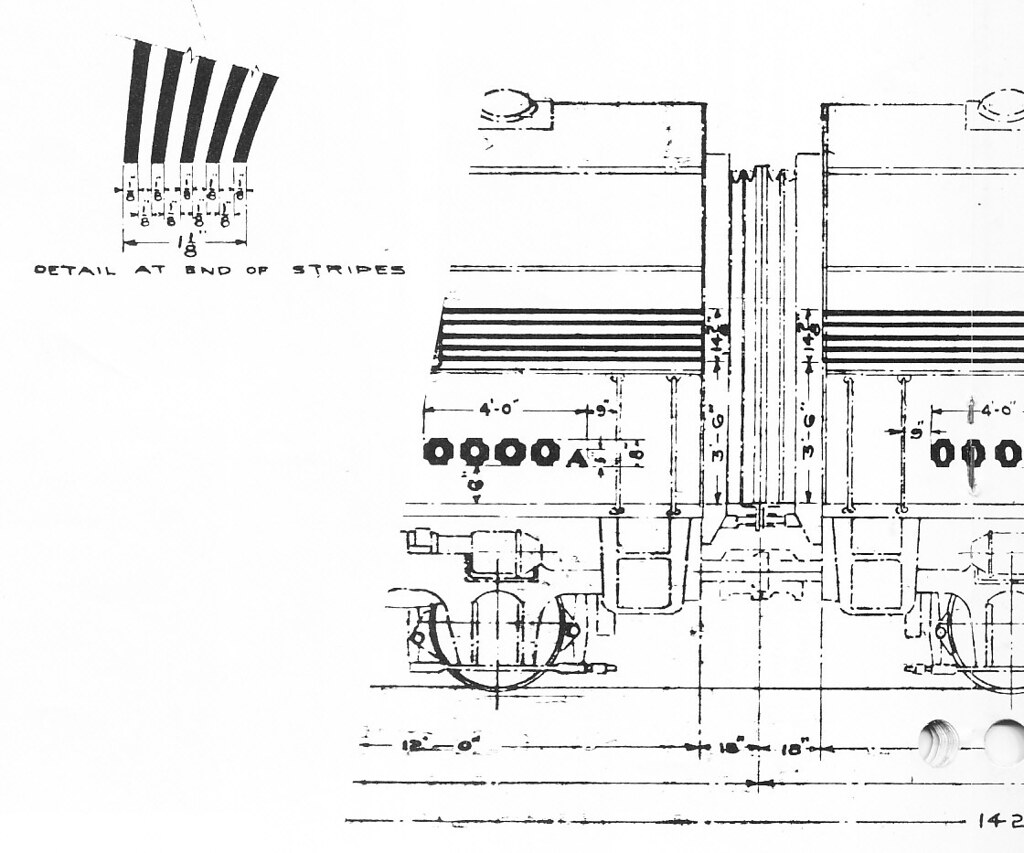 PRR_paint_stripe by Edmund, on Flickr
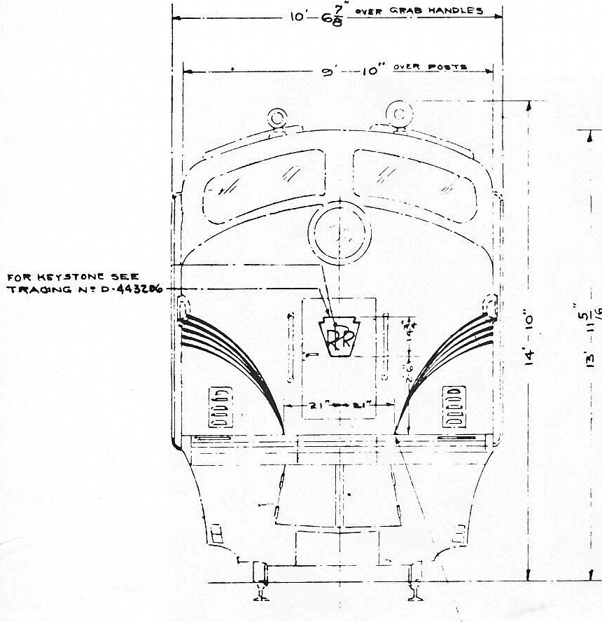 PRR_paint_stripe_nose by [url=https://www.flickr.com/photos/102225238@N06
If the trucks on the Walthers PRR GP are black (as they’re supposed to be) then the picture is seriously overexposed / overlit. I’ve seen pictures in the Walthers Flyers with an engine where it looks like it’s floating on a black void since the trucks are black and show no detail. Back to square one, until someone sees one in person it’s just guesswork what they really look like.