WC Fan- I think your layout’s center of attention is that huge brick building in the center, or the grain elevaitor. (forgive me if it’s not for grain, I get the mixed up with cement plants all the time, although, knowing me, it’s probobly not either!)[:D]
I think the center of attention on my layout is Allen Mountain, which is the largest scenic feature on the layout, is the first thing you see when you go over to my third of the basement, and yes, is named for John Allen.
Locomotives. Even when I look at other layouts I notice the locomotives first and foremost. I also believe that layout photos are incomplete without locomotives in the picture.
I prefer to de-focus the viewers’ attention and let them find the smaller details, rather than pull everyone in to look at only one or two things. I believe in subdued colors, too, because to me they look the most realistic.
The eye-catchers are in the eyes of the beholder, too. Some will concentrate on the structures, some on the figures and some on the automobiles. And a few even look at the trains…
For me as the center of attention has to be the engine service/engine house area since theres usually a flock of locomotives to look at.
(slap!!) So that’s why all the funny looks…!!![:-^]
The focal point of my layout is operations.

The first thing you see coming into the room is the paper mill and all the attendent sidings that serve it. As you survey the room, you’ll see a yard and engine terminal, a junction, and several different points where industries are served by rail.
When you glance away from the scenery, you’ll see car cards clipped to the fascia, clipboards with switch lists, and a train schedule.
The other focal point would be the scenery in general, which is my favorite thing to work on.
Lee
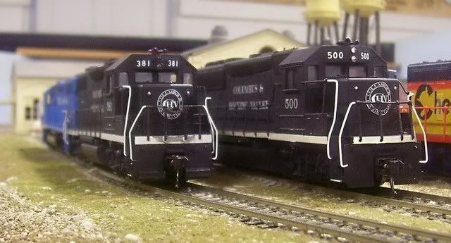
Lee,Mighty fine looking B&O GP35s.[:D][tup]
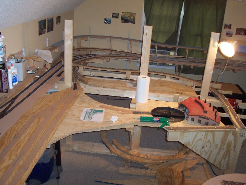
Since it will be physically impossible to see my entire (presently under construction) layout from a single point, I propose to have several visual centers of attention, which will receive the appropriate level of detail:
- Construction scene where the track is being doubled - bridge foundation under construction (with operating pile driver), and a TBM working its way through the adjacent mountain (window in the fascia.)
- Large crew/engine change station, with a puzzle palace of specialwork, partially under catenary.
- 5-tiered pagoda, and the adjacent grounds of the Tomikawa Tera, overlooking beautiful downtown Tomikawa from a low hill with tracks on both sides.
- Single track crossing a steep cliff face, short tunnels alternating with short deck girder bridges (painted red-orange.)
- Hard little knot of trackage (including a double slip switch) jammed into the space between a high bridge and a tunnel portal.
- Major coal mine, capable of unit train empties in/loads out operation with the additional ability to live load loose cars.
At most, two of these might be visible from one place without turning one’s head, but in one case the viewer would have to back up against the water heater to do it.
I look on each as a construction challenge, but MY main center of interest is operating the railroads - every train on time.
Chuck (modeling Central Japan in September, 1964)
[quote user=“Dave Vollmer”]
What’s the center of attention on your layout?
Seems like a silly question… but it’s not. Each modeler has his/her own idea of what the “message” is that he/she wants to convey. This is often done by having some part of the layout be the center of attention. For some it might be a steel mill or a coal mine. For others it might be the scenery. Still others build their layouts to showcase their structures.
For my layout, I wanted the center of attention to be the trains themselves.
To that end, I wanted the layout to be a 3-dimensional backdrop for the trains.
But, there’s a problem… In 1956 (the year I model), the PRR (and many other eastern roads) used drab colors that don’t draw attention to themselves. Locomotives were mostly a black-green (known as Brunswick Green or DGLE) or a Tuscan red. Freight cars were variations on the boxcar/oxide red theme. These colors, against a backdrop of trees and brick structures, don’t exactly stand out. So how can these trains be the center of attention?
The solution was in the ballast. My previous layout had used a brown colored ballast (Highball Brown) with cinders-it looked very dark. It made the overall layout almost too drab. While the colors were similar to ones I’d seen on PRR coal branches in photos, it made the layout seem dark and unfriendly. Plus, the trains did not stand out.
The current layout uses a much lighter colored ballast. I used Woodland Scenics’ fine gray blend. It’s a bit on the coarse side for my tastes, but the color was similar to some of the mainline PRR photos I’d seen from 1956. Fortunately, the “Standard Railroad of the World” didn’t really have a standard ballast color (photos show every color from brown to black to gray to almost white).
I then framed this light colored ballast with a cinder shoulder. &nbs
Yes!.. except that two reds vs three ambers in a horizontal line indicates Absolute Stop. That extra light is a pain; I ought to just cut the lead.
SO the focal point of Dave’s layout is his morbid fascination with train wrecks… Just like Gomez Addams!!
Uncle Fester
I can’t read those signals anyway![:D] I just wish I had working signals![bow]
I guess the center of attention on the Yuba River Sub is the Fall mountain scenery. At least that’s what everyone who has been in my garage says.
I always thought it was my bridges–God knows I’ve got ENOUGH of them–but everyone just seems to be hung up on Yuba Summit, or the hydraulic mining scars at Malakoff Diggings or Bullard’s Bar Lake. Actually, to a lot of my friends, the trains are almost incidental, LOL! Except that they like watching them climb over and through the scenery. Oh, yah, and those vibrant Fall colors in the Sierra.
Tom [:)]


Thought it is still in the early stages of layout construction, the center of attention for my layout is the roundhouse, roundtable and swing gate area.
So this is why I am forever going on about ballast! [(-D]
It’s even easy to highlight main track from lesser tracks… You want to focus on one piece of track or away from something… just put in a patch of new clean ballast worked by the MoW crew…
Exactly the same use of colour (and light) can be employed with anything else. Our eyes and brains naturally pick out what is different in any scene… whether it is the black and yellow of a wasp or a bright advert…
A building can be made to stand out by re-pointing al
| 
|
| - |
Uh, Dave,
The signal on the left reads APPROACH, while the signal on the converging track says STOP AND PROCEED. Doesn’t that just invite a collision? Or are you just testing us, to see if we’re awake?
Yes!.. except that two reds vs three ambers in a horizontal line indicates Absolute Stop. That extra light is a pain; I ought to just cut the lead
Don’t cut the lead, just install a switch. This way, the towerman (you) can give a train permission to follow another train into the interlocking.