=
Hi!
May I suggest you do something a little more involved, but will bring you significantly more rewards…
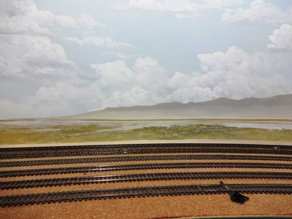
As you look at the horizon, the lowest part is almost a translucent white, gradually getting “more blue” as you look upwards. At the highest point, the sky is the bluest.
Get a can of medium (more light than dark) blue, and a can of white. Both should be flat, latex. With a couple of 2 inch brushes, paint the top of the backdrop the straight blue, the middle a mix blue/white, and the bottom straight white. Then, blend the shades together to form a gradual color change from top to bottom.
Being latex, you do need to work fast, and I work from top to bottom in a 3 foot area or so, and then more on to the next. Meld the colors together (we are not making stripes), and frankly the messier it is the more realistic it becomes.
Now if you want to kick it up a notch, while the backdrop is still wet, do some clouding with a white paint higher up on the backdrop. Sometimes a hint of gray will make it stand out a bit, but you need to be careful as too much will give you a stormy backdrop.
Hey, this is really pretty easy, but a lot of guys are scared they will mess it up. If you do (which is hard), so what? Let it dry and go at it again.
As you will observe on my AVAATAR, the top of the SceniKing 7"x11" sections were matched electronically at a paint store. If there is a mismatch between the paper photo backdrop and the wall, apply some clouds with a near dry brush, to hide the mismatch. Bob Hahn
Most light blue colors are way too dark to simulate sky properly. For a simple backdrop, I´d choose the lightest blue you can get and mix it with two parts white to brighten it up even more.
If you want to add some depth to your backdrop, you have to start with a near white at the horizon, adding a little blue the further up you go. Do the same with a light gray if you go for an overcast day.
Home Depot Behr 540C-2
The paint cards make sense because they show basically the same blue but in progressively darker or lighter shades.
I blended my backdrop towards the horizon as recommended by many articles and posters on these forums. I takes a bit of practice but is effective. Indeed now I tend to notice very quickly when someone hasn’t done it. However I did not blend with a pure white but rather the most pale shade of the same blue that I found on the paint chip card.
While I have no specific advise for paint color to give you, on the basis of my experience I would say – pick a blue that looks right, and then pick the actual color you use that is one or two steps lighter in shade. While every once in a while you do see a deep blue sky in real life, too solid/dark a blue is almost as much a distraction as unblended tone from top to bottom.
Things like how much light you have on the layout, and what kind, also play a role of course.
Dave Nelson
I used Lowe’s Woodlawn Blue Angel 5003-9B for my sky. Like painting any room in the house the chip will look different at home then at the store. I painted the whole room blue first because I didn’t know when I’d get to the backdrop. I went back and did the white and blue blending as mentioned by others after I had decided how high the benchwork was going to be. This is how mine came out just for reference. 
Wayne
I used the blue and white blend mentioned above. Had the blend point just about eye level as I looked at the layout.
Since the sky can change color hourly, choose a “close” and you can’t go wrong.
My attempts at clouds have not been exactly what I wanted. Since the divider is removable, I painted it off layout, with clouds. Didn’t care for the looks, so tried again on the other side, better, but still not perfect. I’ll remove it and try again when the spirit moves me. I’ll redo the blue/white and try again. Think my next clouds will be high, wispy ones, not the puffy ones I was trying. If your backdrop is perminantly mounted, you may want to pratice on a piece of plywood, masonite or whatever until you like what you are doing.
Good luck,
Richard
Clouds are challenging to do well. No clouds are better than less-than-believable clouds. Look across the Internet. For every instance of clouds done right there are hundreds of clouds done wrong. IMHO
I think that the clouds painted by wrumble are by far the most realistic. Too many times we see the Disney style clouds that scream toy train. The thin, wispy type clouds in layers or scattered tend to give an overall pleasing effect that does not attract attention away from the center of attraction - The Trains.
Joe
I used a color similar to Alan’s. Mine was color matched from some photos at the local Walmart.

I spread out paint samples to check them against everything from planned scenery colors, to structures, to fascia.

Well after the blue had dried, I blended some white drywall primer from the bottom up, keeping extra blue handy to blend down into the white, along with some water to promote mixing on the backdrop surface. Primer is translucent, so it’s easier to prevent too much white from being applied. Clouds went on after this step.
Final backdrops wait until any foreground plaster/scenery mess is complete so I don’t have to worry about slopping anything on the finished backdrop.
I’m using Olympic First Light - its a good match to photos I have taken from the region being modeled, time of year and lighting conditions on the RR. A band of white at the bottom 1/3 or so is painted on and is used to fade/merge the two colors together. It seems to work well for my needs.
Charles
Upon Dave Frary’s recommendation in “How to Build Realistic Model Railroad Scenery” I held up paint chips to noonday sky and chose Valspar 4007-9C “Slumber.” He also recommends the blending of the blue with the white in the center. Upon drying Dave said to spray a light coat of flat white spray paint on the blended section and then add clouds and mountains as desired.
I agree with Mobilman. Real sky is not uniform in color and tends to be lighter towards the horizon. I think the shade of blue near the horizon leans more grayish than white. However, in dryer air, like what prevails in the western US, the sky tends to be more uniform in color and bluer, than where the air is more humid or filled with crud.
I think you should just get some medium blue and extremely light gray and apply them together as you work your way up (or down) the backdrop.
You can use the “Bob Ross” (google search) method of applying both paints one after the other and mix them right on the backdrop to blend them, adding more blue as you get towards the top.
Keep adding and blending until you get what you like. The inevitable slight variations obtained from the impossibility of perfectly matching the colors will look more real than one single color applied uniformly.
Several different companies make military colors. Many nations paint the undersides of their military aircraft a form of sky blue. Paint a small piece of wood , styrene, or fosm with one of these colors and have the folks at your local paint or hardware store color match it.