That IS funny! I thought the exact same thing for a few years as a kid!
See? That’s what I mean: A totally ineffective herald.
That IS funny! I thought the exact same thing for a few years as a kid!
See? That’s what I mean: A totally ineffective herald.
I came to suspect that may have been the intentional result of the line being captively owned by other railroads. (L&N, as well as ACL). Similar in scope to the way NYC once controlled the Nickel Plate. Don’t really want to create too much “sizzle” around a subordinate, out of concern that raised awareness might result in loss of mindshare (or unnecessary attention) for the parent… Just collect the revenues, pay the bills, and hope everybody else leaves you alone sort of thing.
I agree. I like it.
I think the only railroad herald that I actually disliked, was when C&O took “chessie” into the silhouette mode, which looked more to me like a moon setting over a lake with a pine tree in the way.
As a kid I didn’t like the Wabash “Heartland” logo, because it was so similar to the logo on the “I love Lucy TV” show…I always expected to see some “Fred Mertz” looking guy in the crew cab ( and often was not disappointed in that regard)
While there are no logos I don’t like, there are some that I like far better than others.
I love the Southern Pacific and Cotton Belt logos. (I’m also heavily biased towards those railroads though.) They are both simple and effective. Especially the Cotton Belt shield when combined with the words “Blue Streak Fast Freight.” Might as well advertise your best service on your logo!
In terms of modern railroads, Canadian Pacific’s combination of the historic beaver and shield with the red “CP” lettering underneath is the perfect combination of history and modernity. Canadian National’s “wet noodle” is simply brilliant. CSX’s “boxcar” logo was great as well. Too bad they stopped using it. Kansas City Southern and Union Pacific have used their logos since forever, so there is something to be said for those as well.
For what I like less. The original Soo Line logo (pre-1960 Minneapolis, St. Paul & Sault Ste. Marie Railroad not the post-1960 Soo Line Railroad) with the $ used as the S never looked all that great to me. It always came off as the railroad trying to appear richer than it actually was. While I love the RF&P’s slogan of “Linking North and South” it never looked great when used on the logo itself. It made everything too small to read. Put it off to the side and blow it up, like on the boxcars.
Says the guy with an equal meaningless (to non fans) herald.
Most heralds really don’t say anything about the railroad. Well known to railfans, even many of those still working in the industry would not be able to identify the railroads they represent. Some that once spelled out the name, were eventually modernized to only have the word(s) that the railroad was generally known as.
Now, I appologize if it seems like I don’t like the NKP or their herald. I do, but then I know enough about the railroad to recognize what it represents. I was just looking at the book I have on NKP’s Berks last night. (Question. My local hobby shop has a consignment copy, in decent condition, of Kalmbach’s “The Nickel Plate Story.” It’s wrapped in plastic so I couldn’t page through it. It’s got a premium price on it. Would it be worth it?)
If I had to choose a logo I don’t care about, it would be the BNSF “swoosh.” Changing from a full name to just initials was bad enough, but really?
Jeff
The best … by far
BNSF just wanted to rub it in that they are blowing UP’s doors off!
Agreed, there’s an an abundance of non-imagination in both CSX’s and BNSF’s names and logo’s. And now CPKC will soon follow suit, as if Kansas City was the geographic objective of the merger. I say just keep the Canadian Pacific name and be done with it. Union Pacific never gave a flying flip about soothing the ego of a merger partner! That kind of attitude fits the modern P$R spirit of “kill or be killed”. [}:)]
Actually, in the P$R world, everyone should just take a page from the 1970’s Norfolk & Western. Just paint everything black with a bare bones reporting mark non-logo. The N&W was a 60 OR railway before it was cool to be a 60 OR railway. Of course, even then, some bone-head such as myself, will think that the resulting minimalist paint scheme looks bada$$ on a high hood SD45 running long hood forward.
I’ve been through it, thought it was worthwhile. Really enjoyed the details behind the creation of some of the constituent lines that were ultimately absorbed.
But, you can play it safe and review one through your local library before buying. Even if your local library has not got a copy on the shelf, you can have one sent in via intra library loan.
I loved everything about Chessie System BUT the broken dish.
Penn Central was cool. What was not cool was the version with the ‘C’ in red… that was just awful.
I never liked the CSX logo with the little boxcar wheels… although I loved the Berkshire version.
The all-time parade of hokey heralds, hands-down, is all those Herbert Matter drafts of the NH herald. And surely in the top ten is that last B&M version…
We recently had a post about a 1956 set of Great Northern billboard cars that went a long way toward populating the rest of that 10 worst list.
I was not much of a fan of the Amtrak pointless arrow, or that awful Helvetica.
I agree and think this explains a number of things about the Nickel Plate.
The NKP was always rather like Sears’ Good or Sears’ Better; never Sears’ Best. You could see that in the signalling equipment they bought, the single tracking, the wooden depots that were seldom replaced by anything better, etc. The herald, doubtless dating from the NKP’s Babylonian Captivity by the NYC, reflects that heritage.
As to the Bluebirds’ paint scheme: The NKP was basically a freight hauler with a couple or three passenger trains. People and amenities came a distant second to hauling livestock and perishable food from California. For such a prosaic, focused railroad with those great black Berkshire locomotives, the Bluebird paint scheme could be seen as downright whimsical.
As to their herald, once again, the observation is correct. Three enigmatic words, even in an attractive script of a font, don’t say anything about the road. You’ll notice I didn’t suggest the NKP as a road that had an exemplary herald because it didn’t. In fact, the only place one could see that unimaginative logo was on the front of those unimaginative Bluebirds! Or maybe on a timetable. If you think about it, the Nickel Plate’s logo was quite similar to that of the New York, New Haven & Hartford’s, which at least told one where the railroad went.
One herald I like is that of the Erie Railroad. Simplicity itself, easily identifiable from a distance and not cluttered. The Erie Lackawanna logo was a really inspired riff on that predecessor.
Likewise, I really like the Pennsylvania’s and its obvious pun on the state’s motto. With no words necessary, it may be the very best. But the New York Central, headq
Is there any real differnece between a logo and a herald?
I always thought CSX should just embrace the Chessie name and bring it back. I mean, most RRers I know refer to it as the chessie anyhow.
I always thought the Amtrak pointless arrow was timeless. Esp when mixed with a good red/white/blue paint job. The current gray and sheets logo is just so uninspiring. Makes their equipment look so…blah.
I don’t know about worst herald but probably the most influential is the UP shield. It was the direct inspiration for the U.S. Forest Service Badge.
I’ve always thought the “fried egg” herald of the Lehigh & New England Railroad was one of the least imaginative anywhere.
But then, for all intents and purposes they were an “industrial” 'road, flash and panache wasn’t their thing to begin with. Nor did they want it to be.
I thought one of the neatest progressions through logo modernization was that shown by the Erie, the Erie Lackawanna, and the Erie Western. Once you knew their names, it became genius.
The EL is the one merger-era creation that looked cooler than either of its predecessors. Combining the Erie’s diamond logo with Lackawanna’s maroon, grey, and yellow paint scheme was absolute genius.
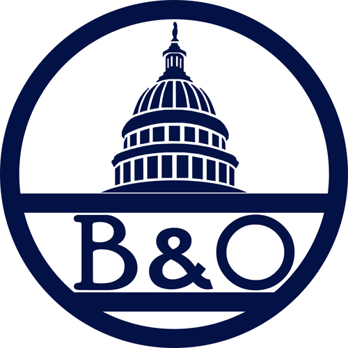
Western Maryland fireball was best, followed by the B&O capitol dome.
I would have to vote Panam Railways as the worst. An atrocity. Just wrong. [A]
While I am B&O through and through
I did enjoy the short period of the Chessie System

While CP’s Multimark was a simple classic, and Action Red with candy stripes look awesome, I can only see Pac-Man whenever I look at it. Maybe that’s why CP stopped using it in the 80s?
CP used a different colour for each division, the airline looked remarkably similar to Southern Pacific’s ‘Daylight’ locomotives.
https://commons.m.wikimedia.org/wiki/File:Boeing_747-217B_C-FCRA_CP_TOR_270775_edited-2.jpg