I’m going to be painting my backdrop, and was wonder any advice. I was thinking of painting it blue and add clouds of the internet. Or maybe I can rember my art skills form 7th grade to help me with the clouds. I won’t be having a city in the backdrop, just something simple. Any tips.
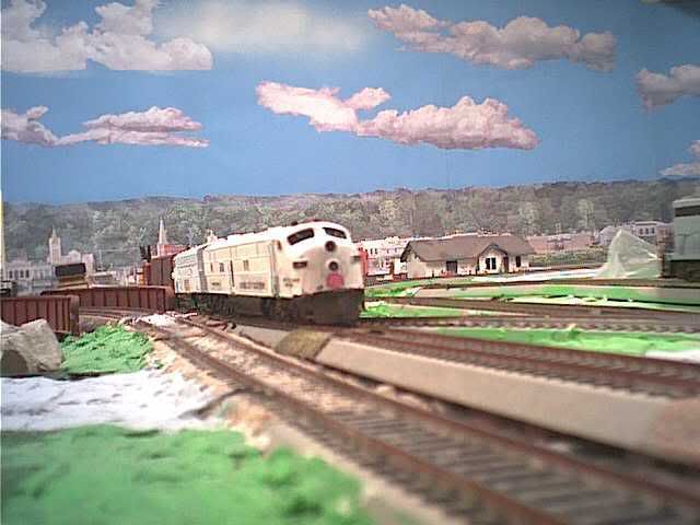
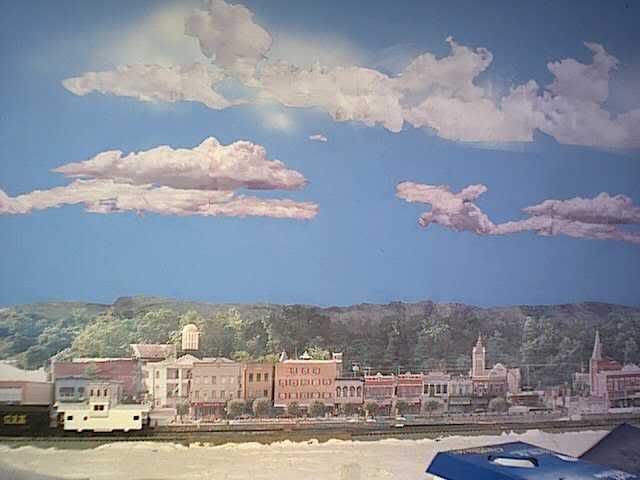
What I do for clouds is to cut out shapes from regular 8 1/2 x 11" paper in cloud looking patterns and then hand paint them using watercolors or water-based paints of the appropriate colors.
Here’s a couple of examples of what I’ve done.
http://www.trains.com/TRC/CS/forums/465810/ShowPost.aspx
I’m going to try this when I get around to it. Wish I could hire Bob Ross to do mine. (happy little trees and bunnies [:)])
My back ground looks a lot like jeffrey-wimberly’s, only it’s firsted painted sky blue, then I use cloud and mountain stenciles to finish it off.
Tracklayer
Jeff,
You’re so humble about this. Your clouds, imho, look incredible. [8D][tup]
What technique are you utilizing to get the dark shadowing effect on the sides and bottom of your clouds?
That’s just stippling with a darker color. After a darker shade is stippled on I let it dry then put in the next darker one. It’s very easy to do.
That’s an interesting method Jeff. How do you attach ?
Those clouds do look really amazing, much better than sky and cloud backdrops I’ve seen. Maybe it’s because you cut them out and it adds depth. Nice job painting them too.
Hi WCfan,
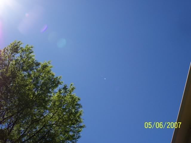
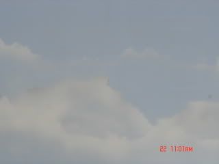
I’m at the same stage in l;ayout building as you. Painting clouds really disturbes me so I decided I’d go outside take a picture and paint what I saw. My cloud painting is over!!! It’s just tath simple. See picture. LOL Seriously I plan on trying water based spray paint and in difference to my wife I’m going to do it outside but it’s too windy. Lots of luck and post some pics.
Bob
Here’s my method:
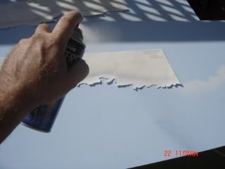
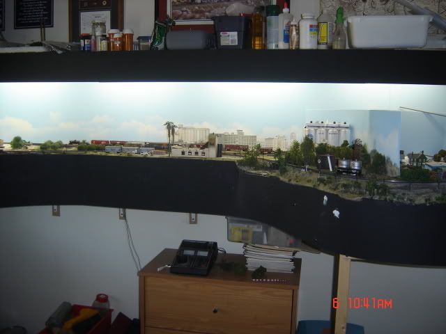
They’re attached to the backdrop with a very thin layer of white glue. It has to be thin or the paper will wrinkle.
I like those a lot, Chuck. They look like - what is that stuff? - water vapour! [tup][tup]
Layout looks good too, even though it’s the dreaded N scale [;)] Any more pics of it?
Mike
Thanks guys for you advice. I think I be prepared when I start painting next weeksend.
If you use this method indoors, wear a good mask, goggles and put a shower cap over your hair.
Simply stippleing white paint on with a cheap 2" or 3" paint brush and then lightly brushing horizonally with a dry brush to soften the edges can yield good results also. It’s best to experiment with a variety of methods on scrap poster board of masonite and then choose the one that you are most comfortable with. The good thing about painting clouds, if you make a mistake, just paint over them with blue paint and try again.
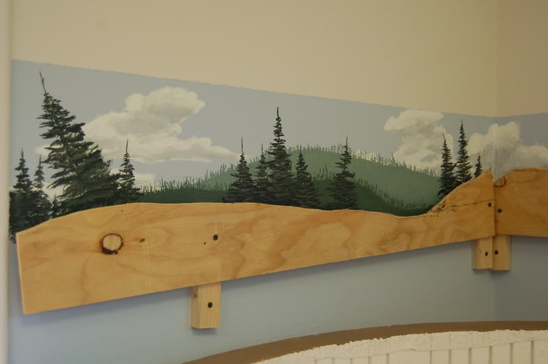
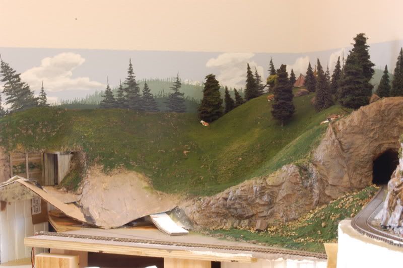
My husband Larry used The Bob Ross technique to paint trees and the hill side over the light blue.
It has been fun matching trees with the trees on the back drop.
Sue
Hi,
While there certainly are some artists in the MR community, most of us are probably of lesser talent. However, painting a basic trees/hills/sky/clouds backdrop is really not a problem. As Loathar says, if you mess it up, just paint over it.
Before doing mine (15x11 all around the room with curved corners), I picked up a couple of books and looked at some articles in the mags for ideas. The basic concept went like this:
-
Outline the horizon (where hills meet the sky), and work the sky first.
-
“Sky” is typically dark blue at the top and a very light hazy (we talk"hazy" last) blue on the bottom. Start the top layer and use about 3 or 4 lighter tints of the same base color and paint them in horizontal stripes. Do a small 2-3 foot area at a time, because you want to blend in the layers so there is no noticable color change line. A 2" or 3" brush works fine.
-
Clouds are white to shades of grey, and outline a few and then horizontal brush to blend in.
-
The “hills” are the opposite of the sky, in that the darker greens are on the bottom and they blend into lighter greens on top - ususally with some grey blended in. Vertical slashes of brown/black make tree trunks, and blotching on various greens on the top make distant trees. Rememer, the higher on the backdrop, the smaller the trees.
-
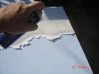
Lastly, and don’t laugh cause this really makes a difference - get a good large spray can of flat white, and do a white overspray over the entire backdrop, especially the hills. This builds in that natural haze, and somehow puts distance into the picture.
Check out some MR articles before you start, and you will get some even better ideas!
Mobilman44
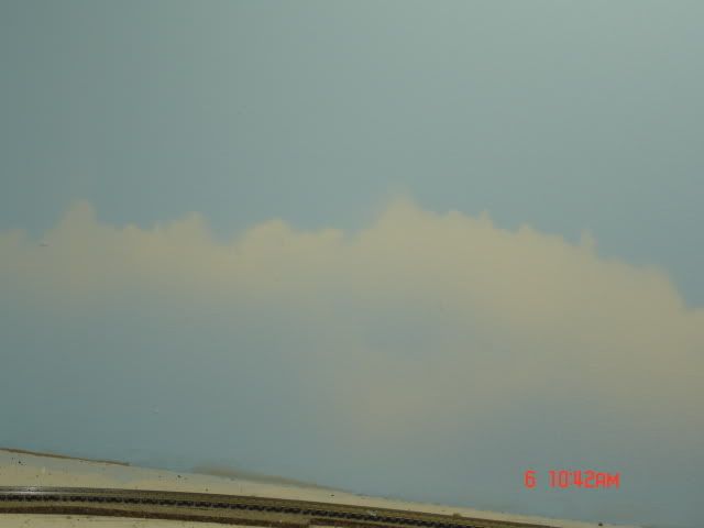
I live in the Inland Empire (San Bernardino/Riverside) in southern California and was thinking that this is known as the brown valley as almost any day of the year the horizon is a grey brown color. So, I was thinking of replacing the white haze most use with sand and a bit of light grey. Do you think this is feazable?
Yes, using the grey or brown spray FROM A DISTANCE is certainly feasable. But I don’t know if you would like the result. By that I mean that for some of us old guys, we want the railroad to represent a good day with clear or partly cloudy skies. Said another way, there are even some of us that either won’t weather their rolling stock or lightly weather at best - simply because they don’t want to see the “dirty” part of the real world.
But of course the good news is, we can do whatever we want to our railroads!
Mobilman44
Just remember distance when you are painting the sky. Take a few pictures of the sky outside and try to duplicate the colors. The horizon is the most important spot. clouds will become smaller and more together. The sky turns from a true blue to a white. Though you can’t see my horizon line because of the mountains that I painted, I still airbushed white over my blue just above the mountains to give the feel of distance.


WC,
You are getting good advice from a lot of these posts. Zak Gardner has done some really good work with his Montana scenery and backdrop.
I’d add a couple of references to this:
- Scenery for Your Model Railroad, By Mike Danneman, from Kalmbach (Model Railroader). Easily the first half of this book is on backdrops, written by someone who really knows his stuff.
- Snippets from a couple of videos.
a. The first Dream-Plan-Build had a basic segment on backdrop painting. It’s a fair start.
b. Joe Fugate’s series includes his Volume 4 on scenery. Joe shows the use of color photos to help get the colors right plus a lot of other good stuff.
Perhaps the best advice is keep it simple and just do it! The basics are a horizon line, a sky with blending of haze down toward that horizon line, and the use of muted blues and grays to represent distance. All of the above references touch on this.
Good Luck!