I am applying primer to the 150 linear feet of backdrops on my N-scale CSX Dixie Line layout, so I recently had to decide on the colors I would be using for my sky. While there are lots of excellent threads on backdrops, very few actually divulge the paint manufacturer and names of the colors they used for their sky. However, one thread actually mentioned the color named Horizon Haze available at Home Depot, so I used this as a starting point. After lots of visual checks against photographs and the actual sky, I found Behr’s Horizon Haze was in fact a great choice for my north Georga sky. However, before spending a lot of time and money painting all of that bckdrop, I wanted a little more reassurance that I was heading in the right direction. To get this warm & fuzzy feeling, I did a liitle experiment on the computer using the Macromedia Fireworks graphics application.
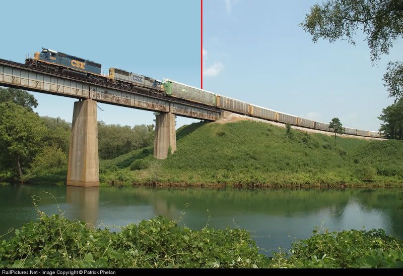
First, I found a good photograph taken near my prototype CSX in north Georgia on a clear sunny day. Using Fireworks, I removed the “real” sky:
Next, I created a simulated sky using two Behr colors: Horizon Haze for the darker blue and Niagra Falls for the lighter blue at the horizon (I was able to get digital versions of the color samples from the Behr website):
Finally, I layered the cutout “real” foreground over the simulated sky and–voila!–I had my simulated backdrop:
You’ve taken the route recommended by many, photo, and match a paint to it. I think why you see few brands named is that with the mixing machines that most paint dealers now offer, they can match any color suggestions you bring in. If your color matches and as you say a little lighter. as your layout is inside, you are happy with it. You have the right color. Many people do not use two different blues, rather, they blend in a little white and start that at the bottom, blending the two colors in the middle.
As long as you like it, you’ve got the right color.
Haha…I think I spent way more time than even ol’ Cliffy would have on this one! One thing I was able to determine by doing this computer exercise is that if the two colors (blues, blue & white, or whatever) are blended in too low on the backdrop, you will lose the “horizon effect” when the foreground items such as hills or trees are added. Jamie
I just completed painting my backdrop about 2 weeks ago. I used Sherwinn Williams “Flyway Blue”. The color seemed a little dark in my basement. After I painted the clouds on it the color seemed to lighten a bit.
The color of the real world sky varies depending on time of day, time of year, elevation above the horizon, location of the sun compared to the direction of observation, etc.
Pick a nice light blue, similar to the color of the blue foam from Lowes, and no one will critique your choice.
The color you choose could depend of the type of backdrop you will be using, if any.
I knew that i was going to use the Walthers series of backdrops, and that I would cout away the majority of the ‘sky’. However, there are parts of the sky that could not be removed due to the artwork. I took the ‘sky’ to the paint store and got them to mix a paint match. After the wall was painted and the backdrops applied, you couldn’t tell the difference in the colors.
I painted my backdrop last weekend using the same behr color. I think the color is great. I would post a picture of it but I haven’t got a clue as to how to go about it.
FYI I am working my way through the second coat of primer now–probably more overkill on my behalf, but that brown Masonite is pretty hard to cover. I hope to get the blue paint this week and get it started over the weekend. I’ll be sure to post pics as soon as I have a section completed. BTW, I did originally consider using white at the bottom but changed to a light blue instead since I wanted a bluer sky rather than a whiter sky that also can be often seen in the eastern USA. Jamie
I first painted mine with a heavy coat of white. Then the next day I painted the blue. I used the Dave Frary method of painting the upper portion with blue and the lower portion with white and then blending the two with a wide paint brush. After it had dried a little, I painted some very light wispy clouds and blended these as well. I am very pleased with the results. Before painting, I used masking tape to cover the screws and the seems. The last backdrop I did, I went to a lot of trouble filling the seams with dry wall plaster only to have it crack a few months later. Only time will tell how the masting tape holds up.
Did you blend the blue and white together when the blue was wet and the white was dry? Because of the tight confines imposed by my shelf-style benchwork, it is going to be real tricky to roll on two blues and blend all at the same time. It would be a lot easier if I could do the light blue first, then come back later add the dark to the top 1/3 or so and blend down. If you (or anyone else) did this successfully it would be helpful to know. I do have some scrap backdrop panels that I have primed and willl use as guinea pigs before I do anything to the real backdrop. This is one of those things that I am way too worried about since I have no experience with it, so I’m playing it very cautiously. Jamie
I used Crescendo Blue from Wal-Mart for the background color. It was $8.00 a gallon! It’s a real good general purpose sky color. I got the color and store from a well known modeler after tying photo after photo under my lay out lights. Grabed a sample and it was “IT”.
Hi Jamie, The first coat of white was like a primer coat. After it was dry, like the next day, you can then paint the second coat. For the second coat, you apply blue at the top 1/2 to 2/3 and more white at the bottom. I used rollers to apply these. While the paint is wet, you take a large paint brush and blend the white into the blue so that it has the effect of pure blue at the top fading into almost white at the bottom. The paint dries pretty fast,so I paint about a 4 foot section at a time, blend, and do the next 4 foot section. It is best to start the painting when you have time to finish all of it. Also, don’t worry too much about messing it up. It is surprisingly easy, and turns out great. I also went back while the paint was damp and blended in some horizontal wispy looking clouds. Take care adding clouds, because you can easily over do it. Keep your strokes with the paint brush as perfectly horizontal as you can or it will look odd. Two guesses as to how I know this. The thing about it is that if you don’t like how it turns out, you can start all over again after the paint has dried. I have also seen backdrops that are simply painted one color of blue, with no clouds at all. It still gives the impression of sky in the back ground. Remember that your trains and the scenery should be the focal point, with the backdrop as a filler so to speak, that rounds out the scene. Hope this helps.
Very nice work, I am doing the same thing painting the back drop on my new HO layout being as I have a lot and I mean a real lot of back drop to paint I’ve tried a different approach at least for me. I am doing a 3D back drop effect. I first painted the wall with flat white latex enamel then I picked a relatively medium shade of blue latex and faded it from dark to light by spraying it with an HVLP paint gun. Starting from the top down and ever just fading it lighter towards the bottom. Any back drop scenery per say being tree’s mountain, buildings etc. will be about 11/2" away from the actual wall it’s self. By using Gator board for the back of mountains as well as using it for constructing actual backdrop building themselves. I have a small shelf behind the gator board which hold Blue,Orange& White or clear rope lighting. This will be used with a conventional 110 volt rheostat to simulate sun set conditions, and night fall conditions combined with different colored track lighting it gives an excellent 3D effect. The clear or white lights are used to cancel out shadows on the painted wall. Nothing really ground breaking here I picked up all of this by reading back issues of MR while I was recovering from surgery a while back. It was cheap and easy to do two things I specialise in cheap & easy. One thing I find particular amusing is every day when I drive to work or when I drive home I make a point of looking at the sky and the cloud arrangements and neither the colors or the clouds are ever the same, so is there a right or wrong color or an in correct cloud, I don’t think so. It all comes down to what appeals to your eye the day you paint them.
Wow–thanks to everyone for the really helpful info on here! Special thanks to the person who recommended Wal-Mart. In all the years of going in there, I never realized they had a paint department. And despite my vow to never to visit the “evil empire” again, $8 a gallon is just too cheap to turn down. [:)] Anywho, I walked out of there with 2 gallons of paint, rollers and trays for about $20…not too bad. BTW for those keeping score at home, I am using the following colors:
Darker Blue (upper sky): Wal-Mart ColorPlace #91444Cornflower
Lighter Blue (lower sky): Wal-Mart ColorPlace #92442Blue Pearl
And here is a simulated scene I did using computer graphics to show how the painted sky colors (left) should look when compared to the actual sky (right) using a photo of my prototype:
These Wal-Mart colors are a much closer match than the Behr colors I originally settled on. I figure if the colors look this close on the computer and they are in the same ballpark when I paint the backdrop, everything should work out nicely. Jamie
Don, While I have yet to start the actual sky coats, others on here should be able to describe how they did this (I am interested as well!). However, I can tell you what my plans are. My backdrops range from 10" to 13" tall. I plan to have two roller/tray pairs, one with the light blue and one with the dark. I am going to roll the dark color on the top 4-5", then roll the lighter color on the remaining area on the bottom. I will then come back with a soft brush and blend vertically (up & down), making sure the blended area is a band about 4-5" high. I figure I will need to do some horizontal and diagonal strokes with the brush to get a good, even blend. I want this band to be about 2/3 of the way up from the bottom of the backdrop so there will be a dark band at the top and a light one at the bottom and any foreground trees will still allow the blended area to show. I am using 1/8" thick masonite, and I have a few 8’ long leftover strips that I have also primed and will be using as my test area before I actually do any work on the “real” backdrop. One other thing, I am using 4" wide foam rollers because they result in a very smooth finish (as I found out with the primer) and are very nimble for getting around in the tight benchwork areas. I also use flat sheen interior latex paint, since you do not want any glare or reflection on the backdrop. Jamie