The Staten Island West Ry is in need of a logo. Wondering how others created theirs? Also how did you apply it to your locos scenery etc?
I looked around to see how the real company logo’s look in the area my freelance railroad operates in.
As I have a New England RR, I saw that amongst the railroad company’s that trafficked the area, some companys had slanted boxes with letters in them. Or as Erie, a diamond with the name in it…
I also researched the evolution of logo’s, and to look credible, it should be seen that the logo is older than the era you model…
This is my logo, it is the letters for “The Middletown, Kensington and Eastern RR”.
I had it printed on decal paper by a pro, and I made several different sizes to fit different objects.
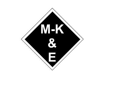
It’s supposed to represent a logo designed in the 20’s, and as my era is WW2, I think it works…
Good luck.
Given what’s in line-of-sight from your probable termini:
Equilateral diamond (similar to previous) with bottom 1/3 blue-grey, center black (mountain range, resembling the Poconos if possible,) top light blue, with Lady Liberty superimposed. “Staten Island,” above the torch, “West” under the base, in gold with red borders.
Or, substitute a shield, the above in the main portion, surmounted by, “Staten Island West,” in gold on black.
Chuck (Modeling Central Japan in September, 1964 - when not playing with 37th-century heraldry)
My “St.Paul Route” herald (as seen at left) is loosely based on something the real St.Paul & Duluth railroad used on some of their stationary and advertising in the 19th. century (but apparently not on RR equipment). I had the decals done by Don Manlick, who also did the artwork. The decals are white on a clear background, and are sized so I can use Virnex red rectangle decals under the herald when I want to use a colored herald, like on a locomotive. On boxcars etc. I just use the decal “as is” so it’s just white on the boxcar red.
BTW it’s going out of use, but traditionally in railroading they call it a “herald” rather than a “logo”.
!(http://1stclass.mylargescale.com/vsmith/Borracho Springs 1.jpg)
I used the Rio Grande Southern sunrise as a start for my logo.
If you are designing a herald (or logo) by yourself, consider color combinations carefully when you do, if you plan to create your own decals. In my case, I designed a logo that had one set of 2 colors, then inverted the colors so that the decal could be used on either lighter or darker car colored backgrounds, as well as a set of different sizes- original, +1.5, and +2 sizes, for application on different areas, such as a caboose side versus a boxcar side. If you want precision, use Adobe Illustrator or a CAD program, as they will enable cleaner lines when printed out. By the way, that “Borracho Springs” herald is a hoot- a “Borracho” is colloquial Spanish for a drunk! LOL Cedarwoodron
Some advice from a logo design book I read:
Always make sure your logo looks good in black & white. IOW, do not rely on color. A stronger looking logo is one that still looks good in b&w.
Never use your logo to spell out the name of your company. For example, look at my avatar, the New Haven’s famous McGinnis “NH” logo. Imagine some letter head or a station sign or a freight car with the “NH” logo on it, but spelling out “New” and “Haven”. If you looked at that quickly, all one would see is the “NH” logo with “ew aven” after it.
Be aware of trying to do too much. Don’t make it too busy. What is wanted is something that people will recognize with a glance, not something they have to read or translate to see what it is.
Gidday Joe, my process for creating my logo was along similar lines as Graffen but with not quite so much thought.
I, too, am modelling a freelanced North Eastern 1950s road and happened to like the Erie diamond.
My railroad is “The Lachlan River RR” named after my son, but also incorporates my daughters initials
 .
.
I also like the Delaware & Hudsons blue and silver colour scheme which is why this particular logo is blue.
I must admit that the letters might be a little flamboyant for the era, but then its my railroad. [swg]
Have Fun!!
Cheers, the Bear.
he logo for the Golden State Railroad is a rising sun over which I superimposed the road name. The rising sun came from images that I have, I copied it and then put the name on. I print it on clear decal paper.

So far I like the Golden State Herald. I am still mulling Ifeas in my head. Thnks for the tips.
Quick google search for “railroad heralds clip art” (without the quotes):
http://www.ribbonrail.com/art/heralds.html
Or you can go to google, select images and search for e.g: railroad herald NY
Or look at the historical evolution of some railroad heralds: http://annyas.com/railroad-company-logo-design-evolution/
There is a huge amount of information out there on the Net, for those who go look for it ![]()
Smile,
Stein
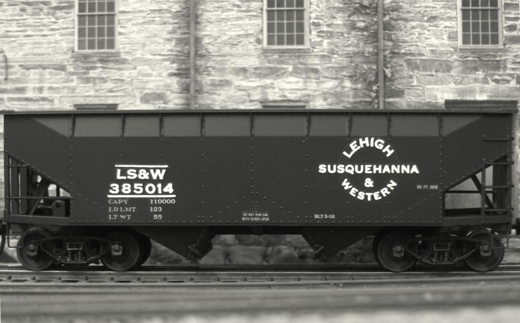
Mine’s simply the Lehigh Valley Flag with the letters “BT&S” in place of the LV. BT&S stands for “Barclay, Towanda, and Susquehanna”. Since my layout is based in 1963, it seems to fit the era.
The LION uses Serif PagePlus X6, It does have a Logo Maker integrated with it, but this logo was made in 3 minutes without the Logo Maker.

This link might help.
After establishing a name and prototype location for my layout, I made a pencil sketch of my proposed herald. After some adjustments and experimentation, I re-did it as a pen-and-ink drawing. The lettering around the perimeter was done with white Letraset dry transfers, and the Indian head is a rubbing from a U.S. nickel, with the image reversed, and then simplified somewhat. The slogan was made using black letters from a Letraset sheet.
My brother made a photographic positive of the image, and this was sent to C-D-S to be made into dry transfers. The sets included the slogans in both black and white, the heralds in two sizes in white only, and large black circles to be used behind the large herald. At this time, the EG&E reporting marks and the car numbers were still being done using Letraset, as these fonts were readily available on large sheets. Only a few cars got actual ampersands, though, as there aren’t too many included even on a large sheet. Most cars, as shown, got the square dot in its place.
Here’s the small herald with the slogan:

…the large herald with a black background and the slogan (some cars got the same with no black background):

Here’s a reefer using the black background (the original reason for its inclusion in the sets):

…and one with a small herald and no background (although it did get an ampersand):

By the time I had used-up most of those 50 sets, Letraset on large sheets was becoming difficult to
My version of the Santa Fe in Texas is thought of a subsidiary with its own corporate identity strictly for legal and charter purposes, with no separate identification on rolling stock. However, the “Santa Vaca and Santa Fe” (Holy Cow!) has its herald, based on the Santa Fe circle and cross, a longhorn steer, and a halo.
Conemaugh Road & Traction has “two logos” – CR&T and Conemaugh.
See the CR&T in my forum avatar. An older program, ProVenture TypeStylist (see Amazon) was used to experiment with various fonts. Also note “the brighter” color choice to stand-out on engines and rolling stock. There are other font/logo programs out there such as LogoDesign (by SummitSoft).
Joe, I think the key to creating a believable logo lies in relating the image to your railroad’s area served. For my Flint Hills Northern, I chose what most people would think of first when the word “Flint” comes up. I also live very near the Flint Hills of Kansas, a fascinating sight, and the source of many flint arrowheads a couple of centuries ago. My railroad serves the central and western part of the Great Plains, so the herald was a no-brainer: I chose an upward-pointing flint arrowhead (swiped from the Kansas City Chiefs), put it on a green field, with the railroad’s name around it in a circle. The result:
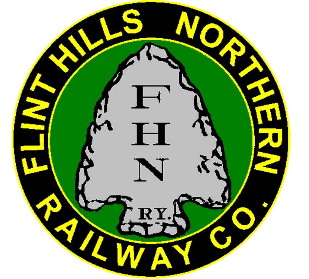
The herald is no longer displayed in full color on the equipment, since it’s expensive to do. It is currently done in white outline form, as below:

Occasionally one can find a car with a plain arrowhead with just the initials, but those are disappearing in favor of the classier circled one.
Here’s a herald with no picture, but simply the name of the railroad artfully arranged. It was designed by my friend, the late biL Marsland (a former Member here).
Unfortunately, biL never had the chance to get his lettering made-up as decals. As a tribute to his memory, I had Rail Graphics do so, with artwork prepared by my brother Steven. BiL’s rolling stock now graces rails in Canada, the U.S., and Europe. [:D]
Wayne
For my road …the Birdsboro & Reading I just used the Reading diamond and replaced the lettering with B & R …


Here is a view of the front ends.

Here is a view showing the Reading with the B&R
