I’m curious, what color trees do you all use for Appalachian mountain scenery? I’m interested in hearing everybody’s opinions on what brands, colors, and textures of ground foam make the best Appalacian trees.
Specifically, I’m using super trees covered in Scenic Express Forrest Green and Green Grass coarse turf and Woodland Scenics Light Green coarse turf. I’m also thinking of using Scenic Express Summer Lawn Flock & Turf to give my trees some highlights. Just curious what everyone else’s go-to’s are. Post pictures too!
I don’t think specific colors are all that important. But, in looking at nature I see a lot of variety. When I put down static grass, each applicator strainer full is different, and I often mix colors with a strainer. I’m modeling stream beds and hillsides, not lawns and golf courses, so the more chaotic my static grass appears, the better I like it.
One thing I would recommend is using brighter, light colors for young growth, and darker colors for older growth. People don’t see specific colors unless they are looking for a specific tree, but contrast in color really stands out.
If you were to use multiple layers of foam, I think starting off with a darker color then moving progressively lighter, just a shade not extreme, would provide more depth.
Early in the growth season, the tips of branches and the uppermost smaller branches will have the lightest greenery, and this goes for deciduous as well as conifer trees. But, that doesn’t last long; eventually everything looks the same except that the tree has some kind of symmetry viewed in profile and from above.
Later, mid-summer and beyond, especially during the driest months, you’ll see more yellow as older leaves die or succumb to a lack of moisture. Where I live in the PNW, mid-June to early September can be absolutely brutal, no rain whatsoever.
So, you kinda hafta pick a time, a type of forest, and go with that if you’d like to nail it pretty closely. The previous post about starting the lower and inner flocking with a darker colour and then getting progressively lighter as you go both outward on branches, near the tips, and higher where new growth also takes place, you would go with brighter greens. Joe Fugate even dusts his trees with a spritz of yellow spray paint, a very light pass, to get that look.
If you go look at some real trees in a forest, rather than individual ones, you’ll not only see greens, but many other colours that you wouldn’t expect…blues, purples, yellows and orange, and even some red.
I use at least two or three versions of green, and often dust the tops of trees with an application of fine yellow ground foam, to create a suggestion of sunlight on the treetops…
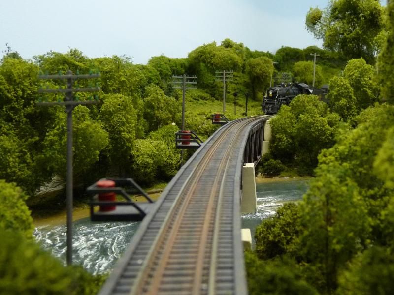
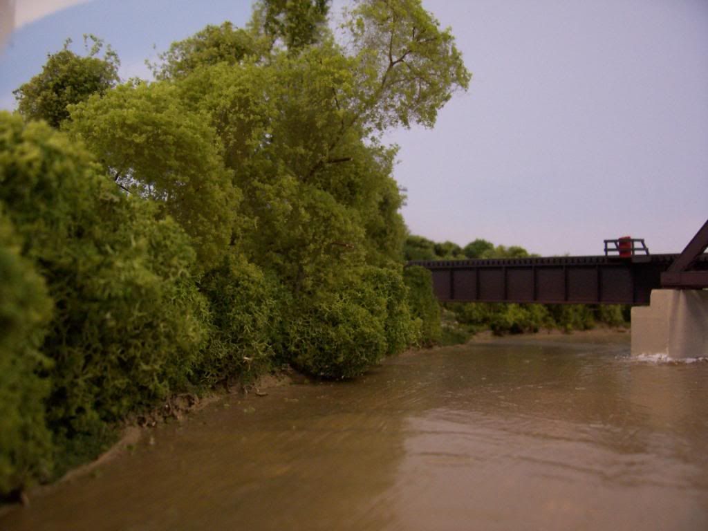
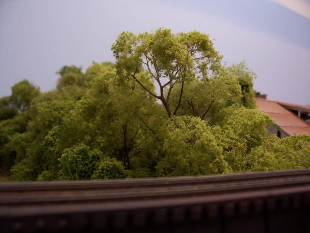
Very nice pictures Wayne. Its always a treat to see your modeling.
Here in the Georgia Piedmont, its very woodsy. Sunlight strikes the trees from various angles. The sprinkling of lighter colors on the outside would help with that look.
You might think about geography too. Also down here, two days of a good rain causes the jungle to liven up again and you can get new growth. So some of the younger chutes can really happen mid summer or any time 8 months throughout the year.
You can’t go wrong with the advice here about using variety of colors. I too use different types of trees and heights for the VA portion of the Appalachian mountains. Those are so pretty to look at; you can easily loose yourself at the majestic scenery.
I would add that the colour of the trunk and big branches should also be taken into account. Most tree trunks are not brown. They are various shades of gray. Some lighter, most rather dark.
Colors can vary so much - be it trees, rock formations, ground cover, water, concrete, and even the sky. And in modeling, about the only guide I agree with is that nothing in nature is shiny.
On my last two layouts, I used a variety of trees (from several mfg) with many shades of green and textures. IMO, this worked out very well, and gave a good representation of the “real world”.
Mix them up, and I don’t think you will be disappointed!
Thanks! I appreciate everyone’s comments, but I have to dissagree. From my observations, nature is not “random” as some have suggested.
When I look at a forrest canopy, especially if scaled for a model railroad, the hills are basically one color. Sure, up close in real life they may have different varriations, but when viewed from a distance (which is how it will appear on our model railroads) the trees are all the same color.
I think using too many different colors would distract from the scale of our forrests.
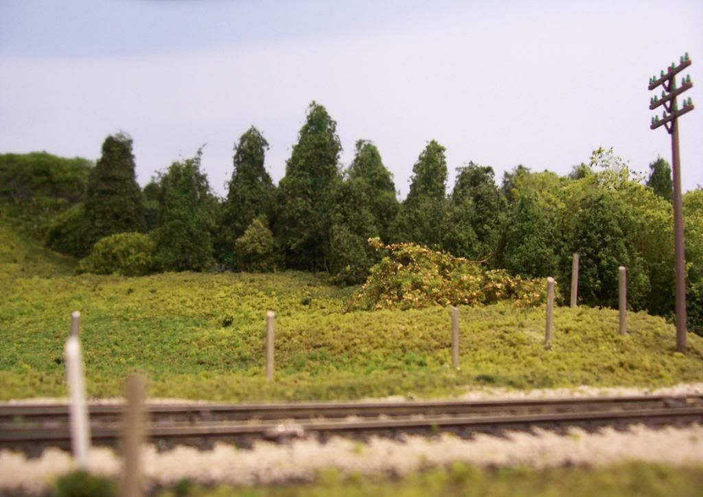
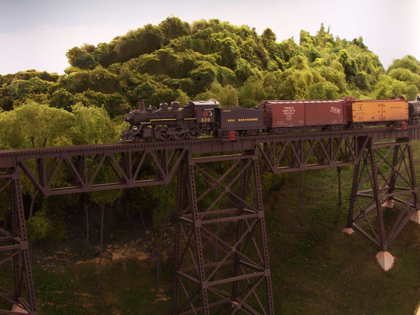
Notice how the trees themselves may be slightly different colors, but the hilside as a whole is basically one color. This is the kind of “scale color” I am trying to achieve.
Distance plays a part. When the question was about modeling trees and using ground foam, several to many actual trees stuck together, perhaps we were thinking about more foreground scenery. If you notice in your pic, that shrub up close is lighter than what’s in the background and has those variations we were explaining.
If you’re modeling more of a background where you would also need deeper benchwork, Dr. Wayne has used a technique using insulation I believe that gives that canopy look without the indivdual detail. (I think his last photo models the forest canopy in the background more than the actual “trees”)
And with backdrops, forests usually mean lots of humidity, so the farther back you model the more haze (gray) is in between you and the forest and the less light there is.
That’s probably more applicable to painting backdrops than modeling trees with ground foam though.
Hi Douglas. Yeah I’m modeling more of a forrest canopy, tree covered mountains. I thought about doing puffballs for my canopy, but I just don’t think they’re detailed enough for me. I’m definitely using Super Trees. It’s only a 4x8 so I can use Super Trees exclusively without breaking the bank.
I plan on using lighter trees in the foreground, with darker and smaller trees towards the back.
If that’s what you’re seeing, then it should be pretty simple to do.
I see a wide range of colours, from the oranges and yellows in the foreground, and the vibrant green, then all sorts of greens, interspersed with black and some areas with a brownish tinge. Beyond that, the blacks have change to blues then further away, to purples and mauves, and grey/blue in the distance.
A painted backdrop might be useful combined with your super trees.
Your photo would be great for distant hills as a photographic backdrop, hills about one mile away or more. For those just past arm’s length on your layout, we’re talking 200 yard-plus. This is what you’d see:
I agree that it takes a good deal of craft to pull off a puffball tree canopy, but it can be done. You just need to do it a step at a time, jab in some bare ‘snags’ here and there as you see in a typical forest, and vary the size and flocking a bit.
A forest only looks isotropic and homogeneous at vast distances that can’t be replicated on even the largest layouts.
From my observations, while tree shades do vary, the variances are subtle. In my early efforts at creating a forest canopy, I used a wide variety of light, medium, and dark greens and it produced what was to my eye, a very artificial look. Light greens are appropriate for spring but trees darken over the summer. Choose either light or dark green based on the time of year you are modeling. If you aren’t modeling a specific time of the year, pick either light or dark and be consistent.
Yes I agree! This is exactly what I was thinking. Too much variety makes the hillside look forced, unrealistic, and out of scale.
In order to achieve a realistic scale model, forrest canopies should be more or less the same color. Oftentimes, monotone scenery is more believable than creative scenery because too many different colors and random textures can be distracting from the overall believability of the scene. You want to eliminate the possibility for viewers to think subconsiously, “Hmm, something’s not quite right here” The brain is easily pricked by anomolies. So by sticking to a limited color palette, as John-NYBW stated, you eliminate the possibility of your scenery looking too imaginative. Instead you end up with a realistic and believable replication of the patterns seen in the real world holistically.
From my observations, while tree shades do vary, the variances are subtle. In my early efforts at creating a forest canopy, I used a wide variety of light, medium, and dark greens and it produced what was to my eye, a very artificial look. Light greens are appropriate for spring but trees darken over the summer. Choose either light or dark green based on the time of year you are modeling. If you aren’t modeling a specific time of the year, pick either light or dark and be consistent.
Yes I agree! This is exactly what I was thinking. Too much variety makes the hillside look forced, unrealistic, and out of scale.
In order to achieve a realistic scale model, forrest canopies should be more or less the same color. Oftentimes, monotone scenery is more believable than creative scenery because too many different colors and random textures can be distracting from the overall believability of the scene. You want to eliminate the possibility for viewers to think subconsiously, “Hmm, something’s not quite right here” The brain is easily pricked by anomolies. So by sticking to a limited color palette, as John-NYBW stated, you eliminate the possibility of your scenery looking too imaginative. Instead you end up with a realistic and believable replication of the patterns seen in the real world holistically.<
I can assure you, tree colour cannot be done incorrectly, as long as it is green.
Use the colours that look right to you.
I have been photographing nature and landscape for years. Trees, especially in Appalachia, come in all hues of green. The perceived colour will change with lighting conditions, atmospheric conditions, and time of day.