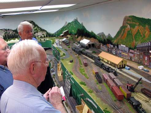
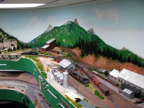
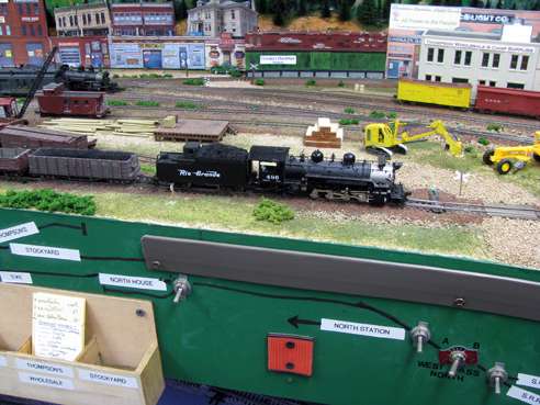
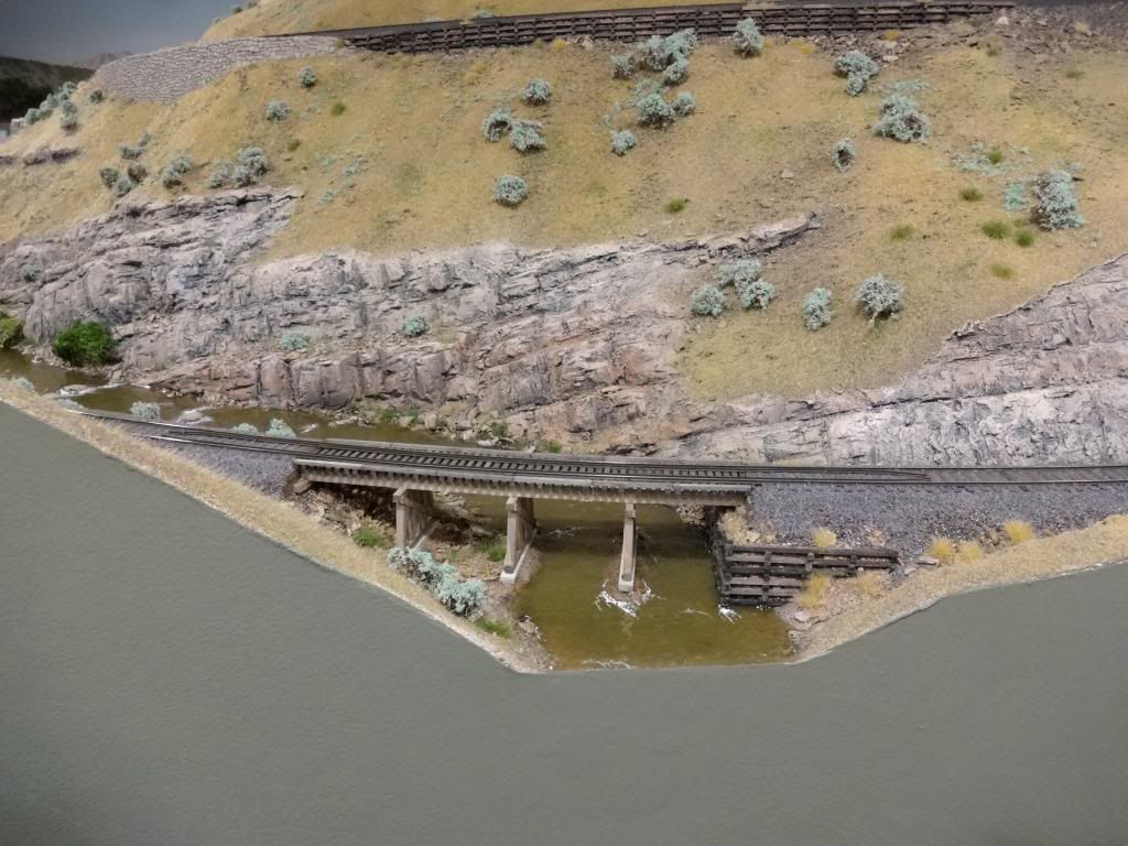
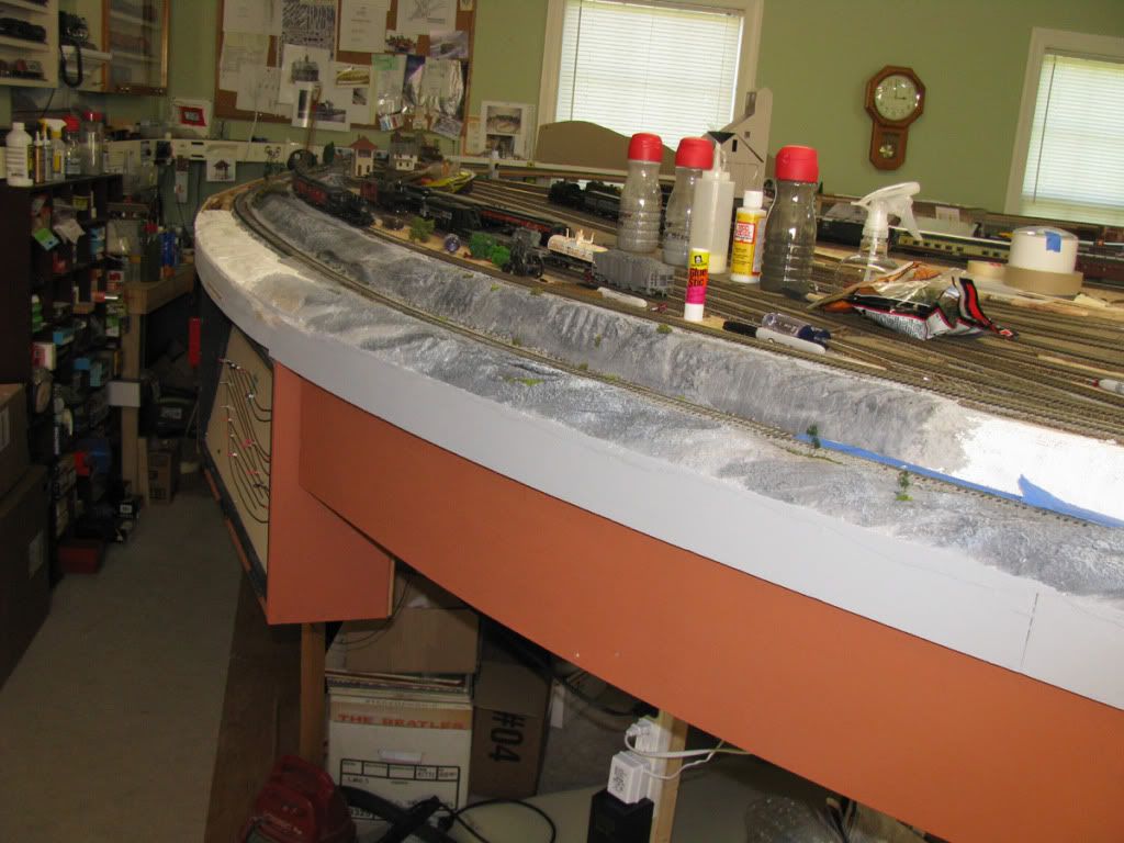
It is about time for the facia and a color has not been selected. What color do you use and why (provide pic example). Don’t know if it makes a difference but my base material is a medium brown.
This subject was recently covered in a post on this forum. A quick search on the right would probably reveal it. Consensus seemed to be flat paint and either a dark color to frame the layout or the predominant color of the layouts landscape.
I’m leaving the Masonite fascia unpainted - for a reason.
I have a number of removable access panels in the fascia, mostly at places where I have electrical/mechanical switch point movers. In such places, paint has a tendency to get chewed up. Also, the dark, mottled brown Masonite color hides grimy handprints better than most alternative colors.
Chuck (Modeling Central Japan in September, 1964)
The search is showing nothing but errors, in other words, dosn’t work!!!
Before selecting a fascia color, here’s a few questions.
How do you want your layout displayed, dramatic presentation or relaxed inviting presentation?
What color is the room you have the layout installed in?
What color is the flooring/carpet?
What is the lighting like for the layout? Is the entire room lit or is just the layout itself lit?
Answering these questions will assist in determining a fascia color that will work best for you. These things are all related to achieving an appealing presentation.
For Dramatic presentation, darker colors work very well. There is a commitment to this though as your lighting will need to be more localized to the layout itself, and the entire room needs to be painted a darker shade as well to “suspend disbelief”
For a Casual Inviting presentation, you should keep your fascia a lighter neutral solid tone. This tone should be a tone that works with the color of the wall and the floor. For example, if your dirt is a medium tan or brown, your wall an antique white, and your floor a tan, you would want to choose a fascia tone like the picture I’m posting. Ambient room lighting works well in this case. Avoid using any sort of bright colors, purple, yellow, red, green, chartreuse, blue, etc. for the fascia along the bottom edge of your layout. Bright colors will distort color perception and in most cases pull the eye away from your scene. Valences should be painted the same as either the sky, the wall color of the room, or the ceiling. 
In both cases of dramatic and casual, fascia should be kept as free as possible of distractions, signage, and other visual focal points. You want to keep the focus on the layout and the scenery not the fascia. [:D]
Treat the fascia like the mat around a painting. Simple tones, hel
LION thinks fascia should compliment your railroad: Forests are Green, Deserts are brown, Oceans are blue, SUBWAYS call for a steel gray finish to the fascia. LION paints other construction elements black. Many are exposed so that people can see the trains moving and the 1:1 oaf can get his 0-5-0 switcher in the tunnels if kneaded.
LION thinks that the black parts of the table are like a cut-away into the heart of the city. One must be careful down there, there are trains, water mains. water secondaries, power, telephone, cable, fiber, gas, steam and sewer down there too.
One tourist was trying to tell his kids that there missals down there, because he saw steam rising through the manholes.
ROAR
I’d love to keep my fascia clear of distractions, but that’s the office area I have. I’ve built a few cubbyholes, too. You do what you gotta do sometimes, because that nice clean fascia does look good.
I’m partial to green…
What I suggest going for is a plain, darker color that matches well with the base color of the background terrain. Various browns or tans in a desert, green like mine for the Rockies, maybe a shade different for Midwest to East Coast forests, etc
I like using a color that complements the 3-D scenery.
I chose a sagebrush-y green.
Flat paint is something I don’t care for in this application. Every time you rub against it when negotiating the aisle leaves a mark. I much prefer semi-gloss as it resists showing wear.
Oh it will be semi-gloss, as for wall color, this is a garage so stud walls, ceiling is finished in a stucco off-white. Lighting is concentrated on the layout, all track lighting using blended CFL’s.
Perhaps one of these. Counting #1 on the left to right most #9
Not sure really of the shade of brown you are using, but there are a few here to get an idea. #4-#7 might be good for lighting that is focused on the layout. I think #4 will a good place to start. From what I understand this is the lighting setup you have.
#1-#3 and #8 would be good when the room and layout are very well lit up together sharing ambient light.
#9 90% - 100% cool black would be good for shadow box effect, should you want to display your trains in a dramatic theater type setting. You may want to consider painting the ceiling a dark tone too if this is the effect you are after.
Skirting fabric you may consider #5, #7, or #9
Rob,
Looks like your fascia is a shade or so lighter then #8. Your photo demonstrates how the eye easily, and comfortably stays focused on the scenery. Neutrals are great for that application, they can also help make your forests feel more “lush”. A competing green tone may make your forests look more yellow if the fascia green is brighter/more blue then your forest canopy. A brighter green fascia can also make your dirt seem a little more red. This may be what you prefer visually. I’m just stating some color mechanics, and how the usage of one color affects the others next to it.
What also throws color perception are the lights, standard fluorescent lights will tint things to green. Regular light bulbs will throw things more to yellow.
Chris
My scenery base is between 3 and 4 or if you are into zip texturing Joe Fugates brown color to be exact. What I mean by blended CFL’s is that out here in California you can get the different screw in CFL’s for cheap so I tried to blend the colors to get close to daylight, may adjust further with gels as I get into photography. Painting the ceiling is just asking for a problem at this stage.
I guess I must be a rebel, I will make mine what ever color trips my trigger.
Ok probably just keep it simple try maybe finding a color swatch (the paint chips from the hardware store) that is about a 2 then. As a spare find a swatch that matches to a 3. I think you’ll be pleased with the results if you go a little lighter then the base shade.
Chris
Rrebel,
Search worked fine today. The thread I was talking about was back in August.
Still dose not work for me!
I had this color mixed for another project and thought it would look good on the facia (along with the grey). Just another color on another layout. It helps to see colors in use.
-Bob
Thats what I thought!
I am vaguely modeling Northern California and for me the #5 brown in the chart works well.
Hi
I paint my facia a colour called reptile grey this is a flat very boring colour.
The idea being that people will look at the layout and say that’s nice
Rather than be distracted by a lump of wood that’s only there to tidy up the edge and hide things behind.
regards John
Where I’ve got fascia, it’s unpainted Masonite.
It’s all the same color, but the light played tricks on this photo.
For most of my layout, I use 1x4 lumber for the outside frame, and then 1x3 strips for rafters. This lets the 2-inch pink foam sit halfway down behind the outer frame. I trim the edge of the foam down to the wood and put on turf and scenic material to transition the layout surface right down to the frame, which I stain and polyurethane for a finished look.
