I always loved the bright paint colors and schemes of railroads and I have been worndering what are your favorites?
The late Garry Boyd, Heartland Division CB&Q was his forum moniker, was instrumental in introducing me to the CB&Q.
This is one of his photos from his layout which depicts, IMO, a very elegant livery.
Cheers, the Bear.[:)]

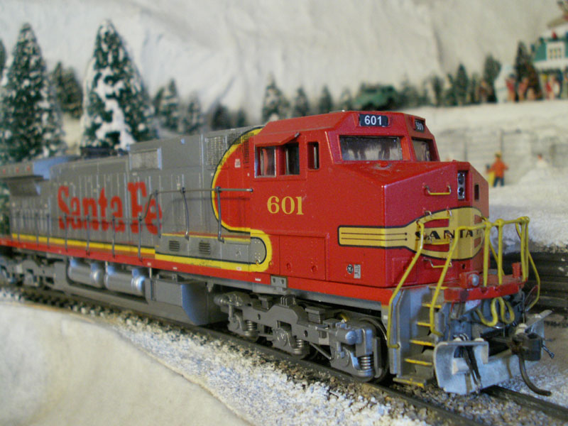
Ever since I was a little kid I loved the Santa Fe War Bonnets. They are colorful and look fast. Of course they were what I frequently saw and we often took the train from Chicago to Los Angeles. (I was so happy when they brought back the War Bonnet paint scheme in the 90s.)
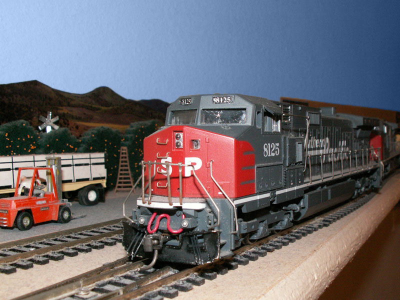
Then one day as a young adult in southern California I was racing a Southern Pacific train that was hauling ass along the side of the 10 freeway. Something about the basic black with the bloody nose on the point caught my eye and I started loving that paint scheme too.
Hello All,
I prefer utilitarian black with safety orange heralds and accents.
Hope this helps.
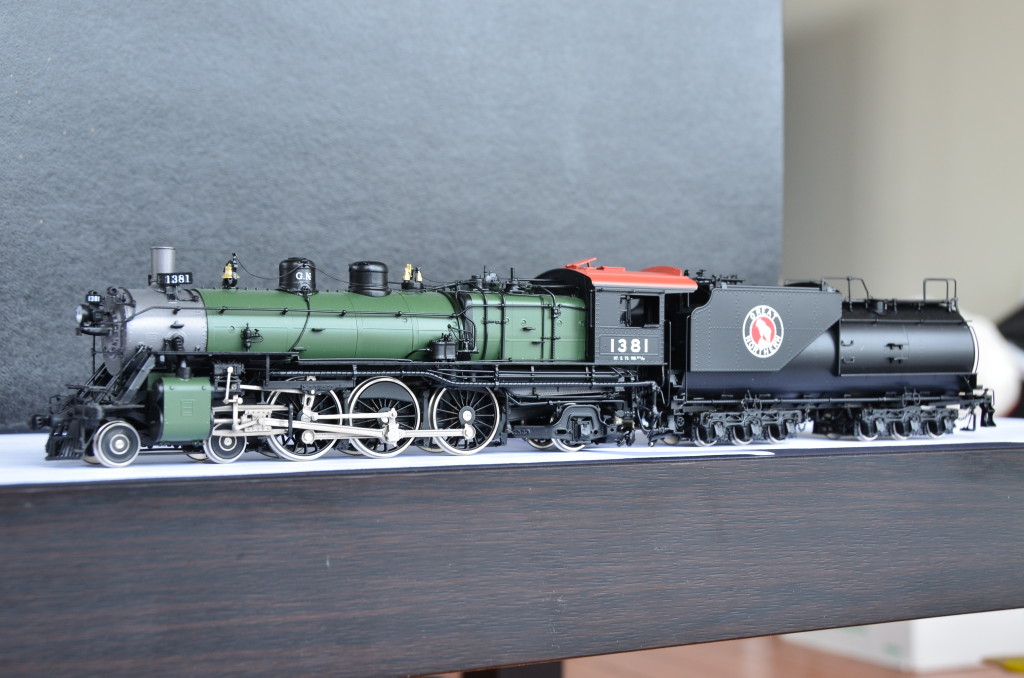
For the steam era, My favorite scheme is the Glacier Park:
For the diseasel era, The Burlington’s Chinese Red is about my favorite, though I also really love the GN Big Sky Blue.

My vote goes to the Jersey Central’s “Blue Comet.”
https://www.broadway-limited.com/6931HeavyPacific4-6-2CNJ831TheBlueCometParagon4Sound/DC/DCCN.aspx
Andy Muller of the Reading & Northern must like it too, here’s the R&N’s #425.
Coincidence? I don’t think so!
It’s a tie between GN Empire Builder, GN Big Sky Blue, NP Lowry Green, or CB&Q Grayback
I don’t know if the scheme had an official name, but this is my favorite.

Bowser calls this the “as delivered” scheme, which is inaccurate, but who’s counting? The tops of the locomotives were painted Oxide Red some while after the SP&S had taken delivery of them.
I also really like Northern Pacific’s “canoe” scheme: 
-Matt
For steam- GN Glacier scheme, but they are a bugger to mask and paint.
For diesel - always liked, and miss, SP’s bloody nose and grey. However I also like the early SP&S with their red/maroon, as well as the NP’s Pine Tree scheme.
Kev
For me it’s an easy choice. The SP Daylight scheme for both locos and passenger cars. It looked sharp in for both steam and diesel locos.
d42a01d8ffad7370136b8246e7443044.jpg (980×649) (pinimg.com)
054e7e3b3b863b8d43479cc3ff51b076.jpg (1301×821) (pinimg.com)
Kev, you’re a man after my own heart. I too like the Glacier Park for steam; as mentioned above, my favorite diesel scheme is the SP&S “red top”, and I really like NP’s Pine Tree schemes, both the passenger and the freight but especially the black and yellow freight version. Matter of fact, when you throw in the later Loewy scheme, I don’t think NP ever had a livery I don’t like.
-Matt
I generally don’t like bright colors on my layout, except for Pacific Fruit Express cars. I have a few of those in yellow and orange schemes. I find they match well with the earth-tones of my layout. But they still get the weathering job!
Simon
I model the 1950s and most of the photos I see from that era are black and white so color is difficult to discern. The few color pictures I see from that era indicates to me boxcar were mostly some shade of boxcar red although the brighter colors did start to appear, especially later in the decade. I model 1956 so I do have some bright colored freight cars, probably a few more than is prototypical, but boxcar red is still dominant.
I deleted my post, I think I replied to the wrong post, or it ended up here by mistake???
weird.
I originally posted it in the Rattle Can Paint recommendation thread, go figure?
Mike.
Matt, you must have posted while I was typing. The Bowser version is what I was talking about, and I will have to get one of their F units in the same scheme.
It might be kind of odd, but I really never cared for the Empire builder scheme, just a personal preference. I do like NP’s Canoe scheme though…
I had that reaction, too, initially, when considering diesels for my pike, which can legitimately run SP&S, NP and GN (and even Milwaulkee Road and UP if a track washout or other rerouting disaster can be conjured up). But I picked up an RS-1 in that flaming orange empire scheme and I have become rather fond of it.
As for the F-7 in the SP&S “red top” scheme, I ordered mine from Trainz.com, probably getting on two years ago. The F-7s are still at the bottom of the list on Bowser’s most recent delivery schedule notice (last August).
-Matt
Non-bright paint colors and schemes - i.e. white block lettering on black or charcoal gray background. Just like a classic tux, it never goes out of style. [Y]
Tom
That reminds me of a George Goebel line he said to Johnny Carson when he followed Bob Hope and Dean Martin on the Tonight Show.
“Did you ever feel like the world was a tuxedo and you were a pair of brown shoes?”
[Y] ME TOO!

-Photograph by Kevin Parson
An all-time classic.
-Kevin
I grew up about a mile from the Union Pacific mainline. As a kid, I rode the City of Portland from Nebraska to Washington.
The train had this at the front end. I’ve always loved the look of the entire UP train of yellow. Back in the 1950s, to me this was a symbol of the future of modern railroads.

That’s why this is on my layout:
