I tried to paint a sunset backdrop and got this

I tried to paint a sunset behind Historic Dayton’s Bluff in St Paul with the skylines of Minneapolis and St Paul in the distance. I realize I had to transform the directions a little, but that happens a lot on the Wormhole and Timewarp Division of the Sublime to Redikulus Railway Company. I did three different panels on Masonite using Bob Ross paints and technique. The first one was on a 4 foot piece and thus too short to use. The second had a lot of mistakes but wasn’t too bad. The third is on the layout now, but I have some doubts. The pictures are labeled

Test 1

Test 2

Test three whole panel day/evening/dusk

[bow]

Man, that is BEAUTIFUL!

I’d imagine that on a art gallery wall, but man it looks good on your layout. [Y]

Great work!

Nik

Better than I can do.

You have some beautiful work there.

However, that said, I think I would go for somewhat more muted colors. You are making a backdrop for your railroad and the bright colors you are using will draw the attention, overpowering the main purpose of the entire layout.

Just my thoughts.

Again, nice work.

Have fun,

Richard

WOW. Well, that is IMPRESSIVE.

Getting thoughts on artwork is tough. I happen to think its awesome. Yes, it is bright and makes you go “whoa” so to some, its too much. Personally, I think it adds some serious “POW” to the layout and I like it. My take is if you bought it, maybe too much… since you painted it, well that adds a great story to it.

My thought is if you were to go with its too much, I would just add some paint your last try and trim down the colors with more grays or purples.

But from someone who is lucky enough to live in Arizona… I see sunsets like that all the time. (Maybe why I like it so much)

Alright Rembrandt, you can stop showing off now.

All serious, it is a beutifully done piece. I’m in the camp of too powerful for the layout though. the “lighting” of the picture is just too much compared to the layout itself.

“But from someone who is lucky enough to live in Arizona… I see sunsets like that all the time.”

Canazar, It was several nights in Mesa this year that inspired the idea. I took lots of pics, but could not get the effect the AZ desert could “paint”.

This is above a little used staging yard so the idea of a wow factor when people first walk in might be good. The coloring of the clouds seems a little off as well. I might buy anther piece of masonite and try again. The process was fun, though frustrating because I am not an artist nor a painter.

Maybe that is part of what I like about this hobby, it alows me to try things I am not good at. Thanks for the comments. If I try another, I will have more to go on.

I would be proud to hang them in my apartment. Their outstanding! I think you have found a second calling. Now just adjust the lighting in your train room and you got.

If I had to find one word for your backdrop, it would be “Dramatic.” I think you should go with it. Sometimes Mother Nature gives us beautiful displays to enjoy. Besides, why do model railroads have to be muted and tend toward the dingy all the time. Tom

Very dramatic and a fine piece of work, I like it. But I also think it may be a bit too vibrant for the layout. Try toning it down a bit, and try to get the sun part of the painting a bit smaller. ( it appears to be on a larger scale than your layout ) . Keep working, it looks like you may have a real tallent for backdrop painting…Mike

D a m n, my sunset doesn’t look anything like that! Wow.

-Paul

Very Nice!

Very commendable, Art. They look really good to me, and I would be proud of them if I had done half as good. [tup]

Crandell

Mesa? That where I live. Right in the middle of downtown actually. Well, if you find your way out here again, let me know, well catch some sunset together.

A sunset backdrop like that will certainly be an eye catching feature on a layout. Folks will gravitate to it like they do to the kitchen on Thanksgiving Day …

If you should have the issue, or see it at a swap meet, check out the May 1962 issue of Model Railroader (or look it up when you get the upcoming 75 year DVDs!). Francis Lee Jacques was a professional painter and model railroad hobbyist of a unique type – impossible to describe in words but by making nothing realistic he made it all hyper-realistic, and his light and shade background effects remain breathtaking. He aimed at the sort of sense of awe that you do in this backdrop.

Dave Nelson

Definitely not a problem. It’s a very nice WOW factor for a layout room and since it’s just a staging yard, photography shouldn’t be too bad on the layout, nor a big problem in telling a story of the railroad. nice work!

You definitely have some artistic skills. I like it. The buildings in the background give the layout a lot of depth. And I love the colors you used. I have a personal enjoyment for sunsets and dark thick clouds that make a great contrast. Is it eye catching? Definitely, but not overtly in my opinion. I think it shows the realistic grand scale of nature with the normal day to day activities being carried on beneath it.

Great job!

Art:

Great job, but didn’t you forget the “Northwestern National Bank Weatherballs” for both the Mpls and St. Paul skylines ??? - they were a fixture from 1948- the late 60s!!! (yust kidding dere, pal!). Actually, that is some eye-popper you have created!

Cedarwoodron

(a former Gopher)

Nice!!

Have you considered trying to backlight some of the scenery in that area to get the last rays of sunlight shining off of the scenery? Maybe with a “warm orange” kind of tint to the light, I bet that corner would look even more incredible with the room light(s) dimmed for the full effect of the sunset.

Sincerely,

Andrew

I loved watching the late Bob Ross create his “magic” on his tv series, where he’d do impressive paintings in less than 30 minutes.

But it was only when ANOTHER series came on, by a guy named Robert Warren, that I realized just how GARISH most of Ross’s work was.

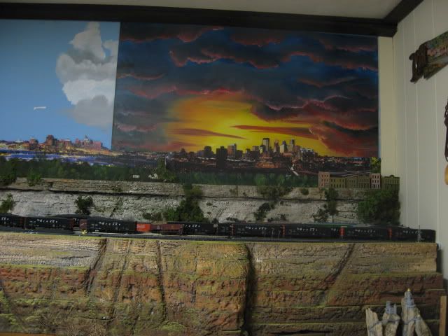
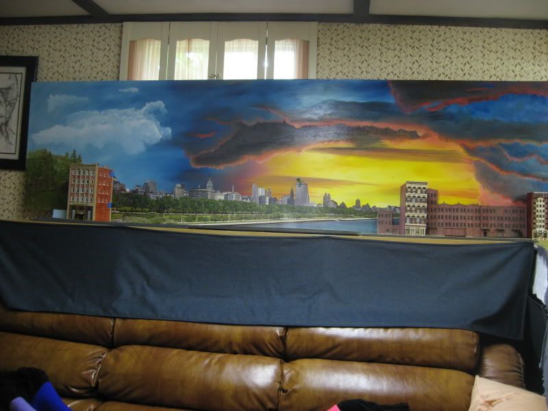
By that time, I’d bought a bunch of Ross paints and brushes, and had tried experiments painting directly on bare gyproc, liking what I saw, and anxious to get going on a REAL LAYOUT finally, so I could use the techniques on a backdrop, like you have here.

If you do any more of this type of thing, I’d suggest you try to find some of those old Warren videos, to see how he would “tame” down the paints, coming up with some really fine work.

Yet, as posted here, now and again my wife and I will look up at the sky, and remark, “Well, there’s a real Bob Ross sky for you!”

Whereas, MOST of the time, its a WARREN sky, with his colours such as “rose pink” and “peach” to be seen.

The other thing we’d giggle over, is how often you will look up and see a cloud, with a shape that is totally unnatural looking. Our comment to one another then, is “…if you painted such a cloud on canvass, people would laugh and say there is never anything in real life that even slightly resembles that.”

In other words, there IS no “correct” version of painting!