I am modeling the Hardwood Furniture Company from Walthers in N scale.
Right now I am painting. I was thinking of adding some details with my painting because I feel that just painting this building the same color would not be as distinctive.
I am painting the concrete panels in light grey. Which painting pattern do you prefer? The green version or the red version?
It seems to me that you’re missing the point: the kit represents a building built from concrete. It should look like it’s built from concrete, not a multi-coloured structure of concrete and brick, like Rich’s example.
I’ve seen some concrete structures, mostly curtainwall-types which, in their later years got the concrete painted to forestall spalling of the surface.
However, it seems very unlikely to me that an all-concrete building would be painted in multiple colours: the fact that concrete buildings offer a homogenous appearance was part of its allure.
Grey is probably not the best colour to use if you wish to portray concrete, as in many cases, a buff or beige might be more accurate…
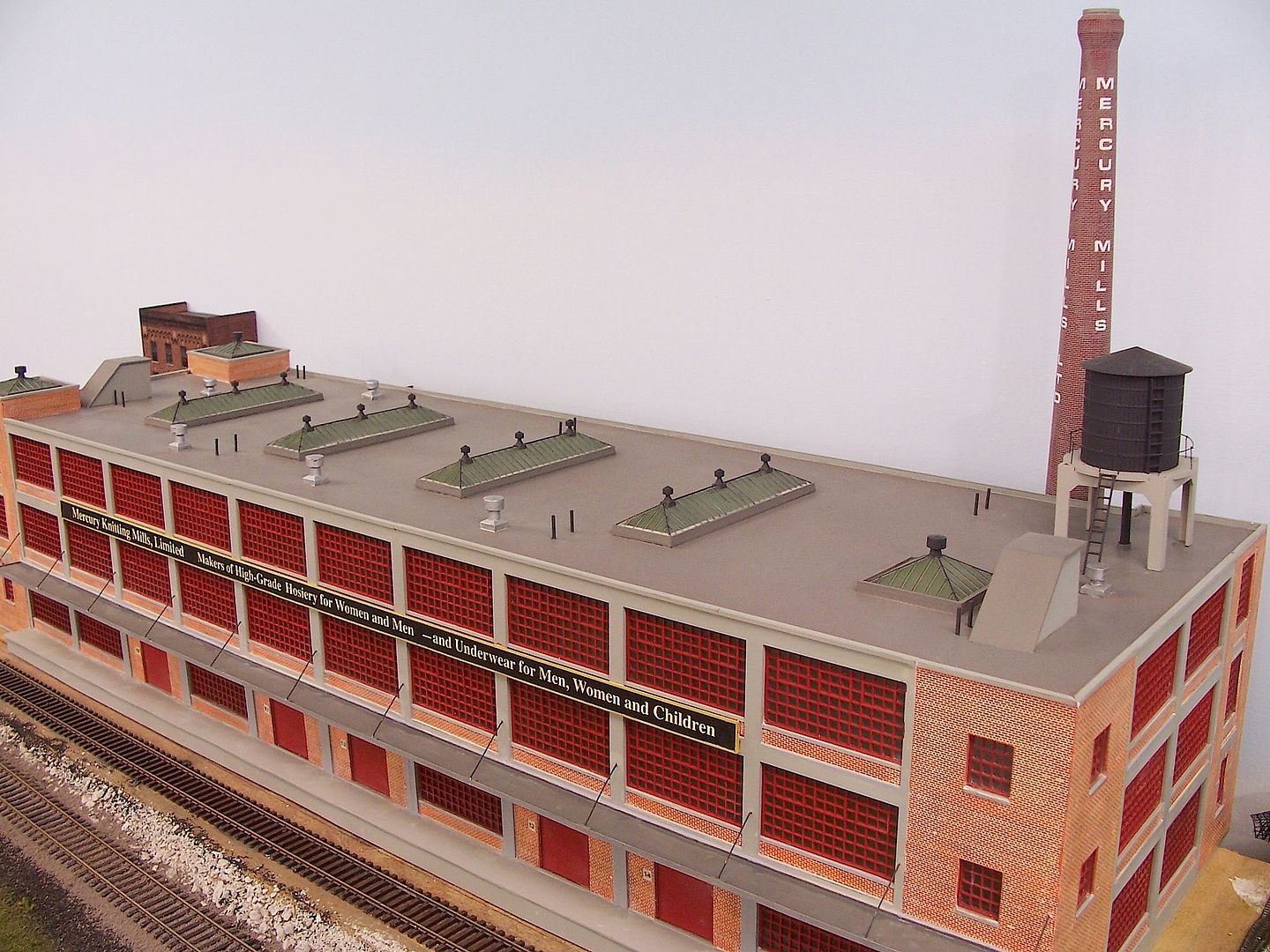
I see what Wayne is saying about an all-concrete building as opposed to a concrete and brick building. His final photo of a concrete and brick building is an outstanding example of the use of color. That said, when the concrete is decorative as in the case of the Hardwood Furniture Company, I see no reason not to use a complementary color on the decorative portions. Just don’t give the colors a clownish appearance. On my photo example, I used three colors. That is plenty of variety. Your window insets will be your second color to complement the dark concrete color of the walls.
I built that exact building kit for my friend Randy’s N scale NORFOLK SOUTHERN layout.
The concrete work was painted light gray and weathered with white chalk. The stone work was painted beige and khaki. The final results looked very good.
I did not interpret any of the structure to be made of brick.
I like to use Google Maps Street View to look for interesting buildings and building facades for my layout. Like real business owners, you paint your building to match how much you want your business to stand out. If your business wants to discourage walk-in customer traffic, your building would likely by very plain so as not to draw attention. On the other hand, if your business depends on walk-in traffic, you’d definitely want your building to catch the eye of potential cutomers. It really doesn’t matter what material(s) the building is constructed from, you can paint practically anything.
Not enough funds in Building and Maintance…so no painting the cement panels now or when the building was built. This is the gritty railroad side of the building anyhow. Also the full size building has been, “cut to fit the mouth” so to speak, (that is a James Saltwater taffy slogen, Alantic City, NJ).
There is actually track/rail with a train, going to the upper level running through/behind that unfinished building. The track and grade (uphill from right to left) hug the wall going behind many buildings along that wall.
I have to agree with several of the other posters in that your building is too dark. I also agree that it should be all the same colour.
As was suggested, if you want some contrast you can paint the window frames a different colour. For the windows I would suggest a darker tone as opposed to bright colours.
I agree with Dave. As opposed to monochrome or multi-color, the building will probably look best with a single color concrete, lighter than darker, and darker, complementary colored, windows.
I think it looks much better. The colour is a good representation of concrete. You might consider adding a very light India Ink wash to represent the grime that naturally settles into the corners as the building ages. I will emphasize the term ‘light’. You can always add a second or third appliction of the wash but removing something that is too dark is a nuisance.
I don’t have India ink wash but I have bottles of black, brown, grey, white and rust washes from Vallejo. Do I use washes everywhere or just in the corners? I bought a few bottles but I don’t know when and where to use them.
I also have a bottle of Vallejo environment streaking grime. Maybe I should use it.
For the window frames, I am not sure yet. I was thinking of maybe using the same dark grey that I painted the building at the beginning. What do you think? Or do you have suggestions of different colors for window frames?
Stef, I believe that Dave is referring to the large windows that will fill those openings. Any shade of gray would be great. I very often use Pollyscale Reefer Gray which is a medium gray. Pollyscale is no longer made but Reefer Gray can still be found made by other manufacturers.