WOW–I am having a problem with choosing paint colors for my mountains. !st timer in all this. What colors should I pick to do the mountains ? How should it be mixed ? I get the thought of ‘trial and error’ but is there a right or wrong way to do this. Please Help
When it came time for me to start painting I Googled “how to paint the Rocky Mountains”. One really good site came up that listed all the colours I would need to do the job. So off to Walmart and picked up about a dozen or so bottles of their cheap acrylic paint. I also bought a 4 Litre can ( i have a lot of mountains to paint) of Granite Gray Latex at Home Depot for my base coat.
First I covered everything with the Gray and then proceeded with all the other colours, spotting them on and dry brushing them as I went. I then made up a few washes in spray bottles of some of the darker colours I had bought plus one with Indian Ink and sprayed away.
The next thing I did was sprinkle finely sifted dirt over it all and brushed it into the crevices ( just like the guy does in this video)
http://www.youtube.com/watch?v=D1D4KBB_GC4
I then used various WS and others ground cover.
I am happy with the results considering it was my very first attempt at Foam rock work.


Talking about foreground or backdrop mountains? I’ll try a post on both…
What you’re asking isn’t a model railroad question per se. You can try the Mike Dannemann backdrop book sold by Kalmbach http://www.kalmbachstore.com/12425.html, or try some books on art technique and color mixing available through a book store or art/craft store. These can start to look overwhelming at first, but for most backdrop applications you’ll only need to work with a few mixes.
The appropriate colors will depend on the type of scenery you want to reproduce, time of year and so on. How you mix and apply them depends on the type of paint (e.g. oil or acrylic), plus personal preference obtained from experimenting on how you like to work. One specific thing I will advise is to avoid pre-mixed greens, as they usually don’t look right behind our model scenery materials. All my greens are mixed from variations of yellow ochre, ultramarine blue and white (distant colors), or black with gradations of cadmium yellow deep, medium and pale (foreground). It takes some practice to use these, but the results should better match colors of ground foam and other scenery materials you’re likely to use.
Here’s a backdrop I completed recently using acrylics. There were only a few colors used, white, yellow ochre, ultramarine blue, Liquitex brand “Permanent Light Violet,” and black (for the road).
I don’t try to do things in one pass. I usually paint a test backdrop from an even more limited array of colors to check for shapes and such, plus the temporary backdrop helps with building up subsequent finished layer
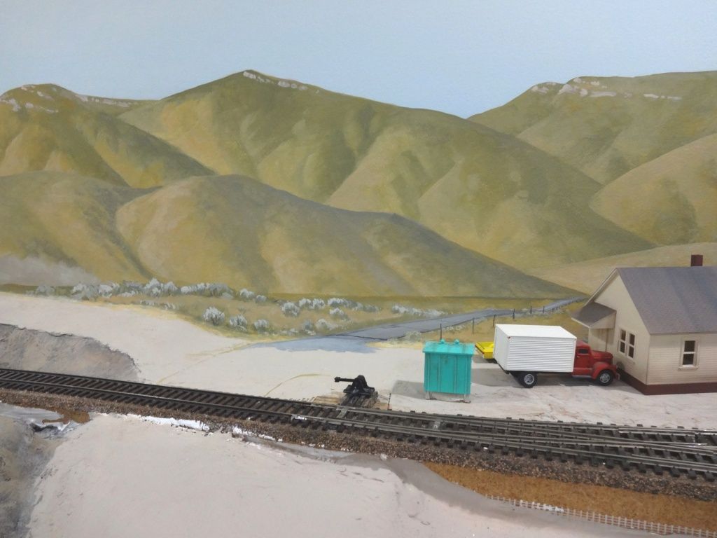
For 3-D plaster mountains, I start with a wash of plain black diluted until it goes on like this wherever I have rocks:

I don’t keep track of the dilution ratio.

For the next step, I layer on two or three dry-brush coats of acrylic craft paint, working from darker to lighter. I used Walmart brand “tan” here, along with Americana “Driftwood.” There’s also some Apple Barrel “Territorial Beige.” The black stays behind for crevices and shadows.
Everywhere I don’t have rocks I skip these steps and just apply plain tan latex. Mine’s Walmart brand flat latex “Sahara Sand.” It all gets covered up with dirt and ground foam anyway, so I don’t pay much attention to it.
Rob.
Tell me more about that rock retaining wall, it looks great.
Thanks.
Thanks - It’s hand carved into a 1/4" or so thick layer of plaster I applied to the scenery base. I used a pencil to draw the basic pattern onto the plaster, then carved it with a utility knife after the plaster had set up, but not completely hardened (i.e. it was still damp to the touch). Carving took about three hours.

Here’s a look at the wall as I was drawing the stones onto it before carving. I kept some photos of prototype retaining walls close by to replicate the patterns. Note that I first marked stone locations on areas of the plaster where I thought a separation wouldn’t look quite right due to variations in the surface. I then filled around these with other shapes where it didn’t seem to make a difference where individual stones ended up. As shown previously, I colored more or less with my standard rock coloring methods, but did hit most of the stones with a smaller brush so they looked as much as possible like separate pieces. You could use the same coloring idea on a commercial wall casting.
Thanks Rob.
You’re a talented guy! And it sounds like more work than what I’m willing to commit to at this point in time. [:O]
Brent/Rob that is some Awesome work right there. It’s an inspiration to us all. ![]() You guys have any painting background or just following advise in Model Railroader?
You guys have any painting background or just following advise in Model Railroader?
Everyone’s mountains look great!
I started off trying various techniques from the magazines and books, but eventually figured out what works better for me and now I just go with that. There’s no “best” or “right” way, just whatever gives you results. I don’t necessarily have a “background” in painting, but I’ve been doing scenery and backdrops so long I guess you could call that having a background.