Looks like I am going to be fortunate enough to have a friend lend a hand and paint some of backdrop…
my question is… what is a good paint to start as a base… he works in a paint department in alocal hardware store… I hoping to do one wall fall and the other spring… or whatever… so what is a good mountain color to use
Go to your library and get some books with color pictures of mountains from Colorado, Wyoming, Utah, Montana, etc. Depending on what you like and/or want behind your layout, have your friend use these pictures as references. I wouldn’t want to try to copy them exactly, unless you are modeling a specific prototype area, in which case you would want to find a picture of that area and try and reproduce it. Otherwise, use it as a guide for general colors and/or shapes. When it’s done, post pictures for us to see.
I would start with a cheap flat latex paint of the basic background color, blue if its sky.
I then use artist acrylics to paint the scene. I like tube colors and a muffin tin to mix colors and thickness. I use the cheap colors from Micheals. ( No I am not an artist, but I watch a lot of "Joy of Painting).
The base color will be tan, mix the umbers and siennas with white and black to get the colors that match the prototype pics. Do not make any of the colors solid and even. Mountains, trees, rocks, everything is a mixture of color.
There is no substitute for practice. If you don’t like a section, paint over with the base color and try again.
Good luck and make this fun. You won’t rival Salvadore Dali the first time around, but it will look good.
If you can, go out on a clear day and look at distant hills…some within 3-4 miles, others much further away. If you can’t, find pictures online.
I have noticed that the more distant mountains have virtually no detail, except for subtle variations in colour here and there, and maybe a medium brown bare re-entrant or outcropping/rock fall. Their treeline atop them, if they exist, is fuzzy, but your mind tells you it is a treeline. The next closest range will look lighter and have more details, including actual trees, if indistinct. That makes the first, the furthest away, look washed out as if painted over with a white wash, almost bluish if you agree with Joe Fugate.
You can really go to town on a backdrop, but if it is too yucky or even too good, it will detract from what you really want to see. In fact, an actual photograph is probably best of all, because it will be so natural that you will dismiss it, while still appreciating that it is there as part of a realistic scene. A really good painting will have you admiring the really good artwork, and forgetting about the layout.
Essentially, you just want lighter, more toned down colors than you’re using for your foreground scenery when you paint in distant mountains. Mixing in some of your sky color helps create a more toned down and blue color, although it also may help to add some darker blue paint as well.
And as Selector says, don’t waste a lot of time on detailing those distant mountains. Just a hint of some mountains is fine … you want the trains to be the focus, not the backdrop. [swg]
That is a nice pic. Thanks for sharing it. I am curious how you got the haze in front of the mountains, is that just a thinned whitewash put on separately? I’d think if you did it at the same time, it would smear everything around? I also like the light coming over the distant hill as though the sun is just about to come up or just went down - nice touch.
I guess I’ll have to take in that scenery clinic. Thanks.
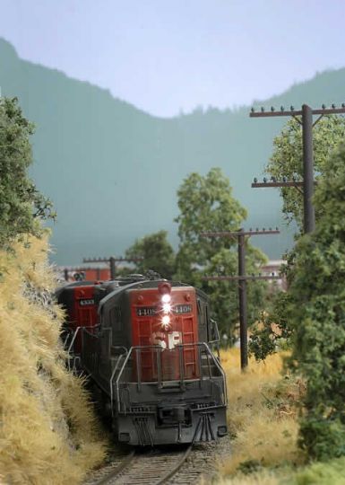
Some of that is just the camera depth of field in the photo (making the mountains appear hazy or slightly out of focus), and some of it is shadow on the backdrop from the train down near the bottom of the hills. Here’s another shot of that location, showing how it appears to someone just looking at the scene from a normal viewing height.
(click to enlarge)
There’s not much fancy going on here, just gray-green mountain silouettes on the backdrop. I did feather some white in along the horizon to give the sky more of a realistic sense of distance (I discuss this in my scenery clinic on my web site as well).
As for spring/summer (Catskills), choose a shade of medium dark green that you like for the foremost layer of backdrop color. Get a color chart or strip listing your paint and buy a quart of your color and a quart of the next lighter shade on the strip. If you like get one more can two shades lighter from the same strip. You want the color “tones” to be from the same family just of several lightnesses. Also buy a quart of white or off white. Mix some of the darker greens with white in spare cans to create one or two more lighter shades. The lightest shade should be almost a grey and you can mix in a small amount of sky blue. All paint should be flat latex.
Also buy paint for the sky. (I used Benjamin Moore “Bayberry Blue”, but it’s all up to what pleases YOUR eye) Paint your ceiling / upper wall sky color. Mix your sky color with white about 3:1. While the upper paint is still wet, apply the paler blue to the lower part of the sky. Go below the locations of the mountains. Do a few feet at a time and mix the two shades of blue together they touch.
You can lightly mist with flat white spray paint to blend and de-focus the edge.
Let the sky dry, then sketch several layers of overlapping hills on the backdrop with pencil. Paint the furthest mountains or hills with the lightest green mix. Do not cover the entire wall just the parts that won’t be behind other closer hills. Take the smallest stencil brush that you can find (1/8"), tap the brush onto the paint and then by tapping along the top of the ridges with an almost dry brush, create a line of fuzzy trees. Let the paint dry then mist VERY lightly over the green and lower sky with white spray paint.
Repeat the process with the next darker shade of green, the next closer set of hills and create the tree li