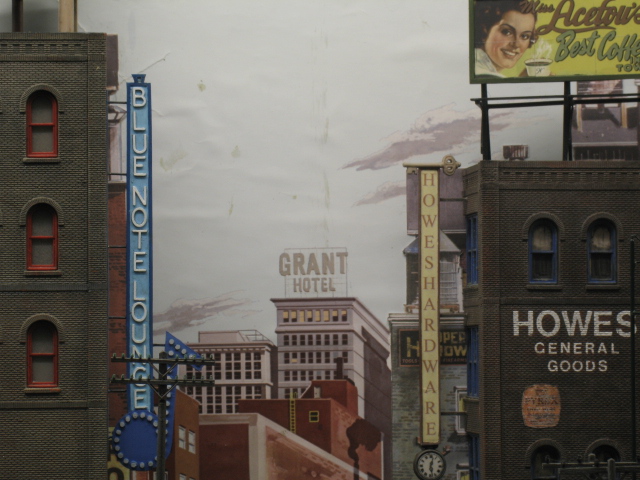
With the recent track relaying and scenery upgrade, I decided to overhaul some of the names of the industries as well. Not only are there a couple of new rail-served businesses, there are also a few relocations to ensure that each industry could accommodate at least 2 freight cars - making the car-card operation that much easier.
Lastly, there were a couple of relocated signs because either the building had disappeared or the sign kept getting knocked off in transit.
First up, some relocated businesses.
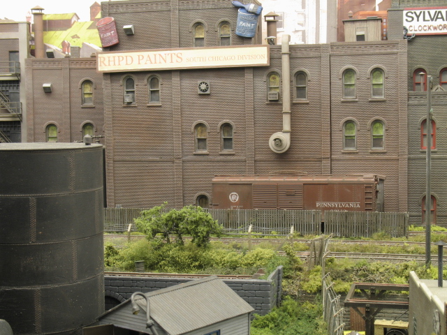
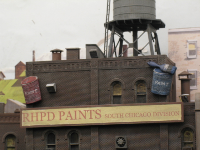
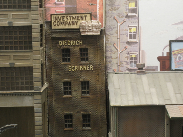
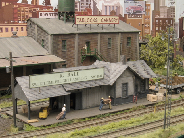
RHPD Paints has moved to a newly rail-served building (was Diedrich Scribner)
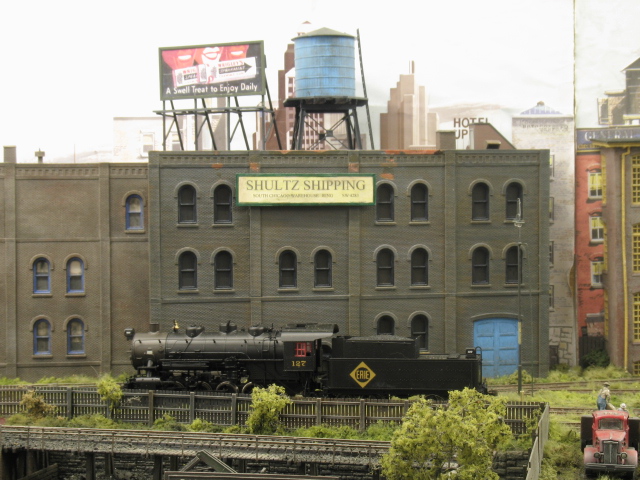
Shultz Shipping has 2 freight car access (was RHPD Paints)
Diedrich Scribner has downsized due to the Depression/recession
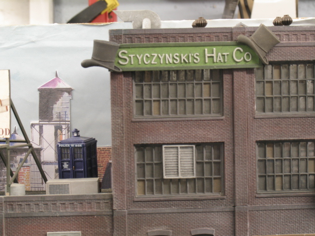
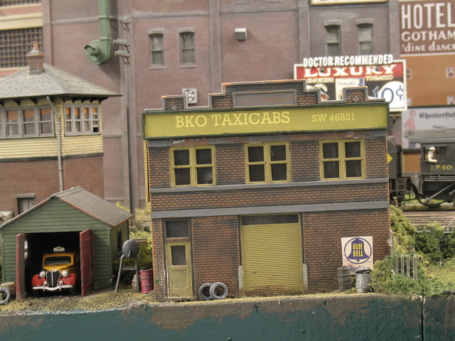
The original BKO Taxicabs was demolished in the upheaval, so the company moved opposite (was Styczynski’s Hat Co). Hopefully the sign will not fall off this time.
This sign came with the kit and went on for speed prior to last weekend’s show. It will be changed out soon.
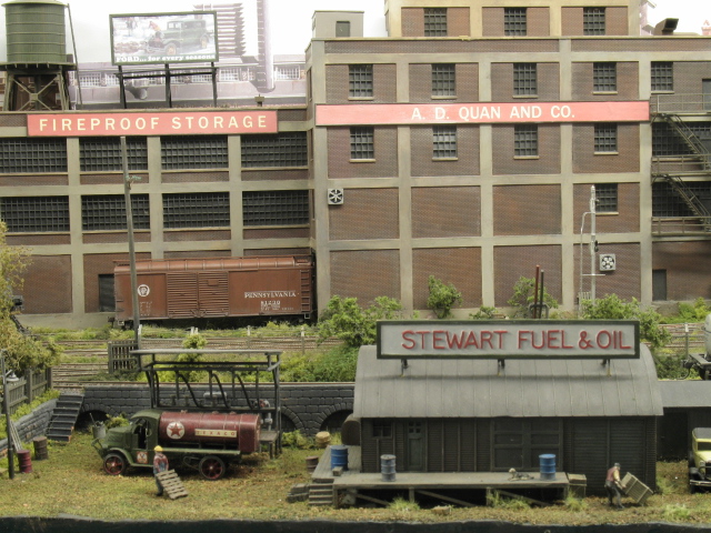
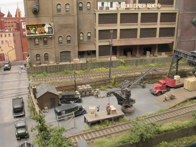
The team track gets an agent at last.
The building on the left has been added to the REA to accommodate a third freight car spot - was Shultz Shipping.
As I use car-cards and waybills, I had to name all my lineside industries. I chose to name them all (REA excepted) after various forum members who have provided invaluable assistance with information over the last few years.
Your signs and modelling are magnificant. Some of the lettering on the signs looks like it is raised–true?
I spotted the Blue Police Box (Bobby’s Bos) next to the sign and on the roof of the Hat Company–was that placed transported there by Dr. Who? Or is that a UK humorous insert?
I use plastic letters from English company Ratio which comes in several different sizes. BTW, the ornamentation - hats, clock, key and paint pots - are speciality clothing buttons, available from craft stores (Hobbycraft in UK for one)
All my layouts have had a Tardis on them and, as the police box is out of place and time for the location and period of the layouts, it must be the Doctor[;)]
(What follows is intended ONLY as a comment, NOT a criticism, bash or the opening shots of a flame war.)
Jon, I really like your layout, and was very pleased to see it featured in CM recently.
Typography is something of an interest of mine, in particular as it applies to signage and graphics for layouts. I’ve come to recognise certain styles that are very specific to a time and place, such as 1950s USA.
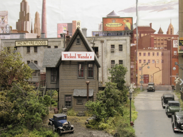
I think it’s great that you’ve given names to all your industries, and applied signage to suit, but some of the typefaces you’ve used on your signs don’t ring true to me for 1950s Chicago. The two examples that struck me were the cab company and “Wicked Wanda’s”. On the cab company you’ve used a typeface most commonly associated with typewriters. As such it is a monospaced font, which I seriously doubt would have been used by a signwriter of the time, based on what I have seen in photos and in person. The effect is that of a sign which is too modern for the period being modelled.
The “Wicked Wanda’s” sign looks far too modern as well, both the typeface and the use of lower case letters appears anachronistic to me. Most building signage of the time seems to use gothic typefaces and upper case.
In some respects it’s hard for me to quantify why some signs and graphics appear anachronistic, since it relies on familiarity with some fairly arcane aspects of typographical history, but even a cursory glance at some period photos will show what I mean. There are a couple of colour books published by Morning Sun which show scenes in around Chicago during the fifties which have many examples of typical signage and graphics. If you’re interested in knowing more, I can send you some scans.
All the best,
Mark.
PS - Love the TARDIS. The most recent Christmas special, the one with our Kylie, just screened here in Australia. What a ripper! Can’t wait too see the new series with Catherine Tate, either!
G’day Mark. Thanks for the comments - all very constructive, mate.
Since the article was published in the CM last year, I have been busy backdating the layout to the 1930s, so the typography could be even more ‘wrong’ than before. I would welcome your comments and suggestions for a typeface more prototypical for the 1930s, and would alter the typeset on the signs already done on the computer.
Jon
PS - we get the final episode of the current series of Dr Who tonight - a right old cliffhanger it is too (best series yet). What with the final episode of Heroes last Thursday, I’m gonna have nowt to watch on the tellybox.
No worries - I’ll scan some photos over the next few days and gather up some links to post as well.
The move back to the 1930s is an interesting choice, given the popularity of the so-called transition era. What made you go that way?
The first episode with Catherine Tate screened earlier this evening here. Absolutely brilliant it was, too. Every series seems to improve on the last, and that’s saying something. Seeing that glimpse of Rose at the very end was a bit of a surprise - I take it she’s going to turn up again?