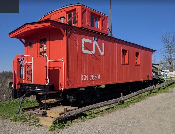
All I know is that it was originally Port Stanley Terminal Railway #65.
That is what it should appear as! The CN noodle is all wrong.
At the least they should use the ‘Serves all Canada’ Maple Leaf
That would be more period authentic although there probably was a few wooden cabeese that got the noodle, but that’s not the point. They would have been for some special purpose.
Great shot of that preserved CNR caboose! That’s more like it!
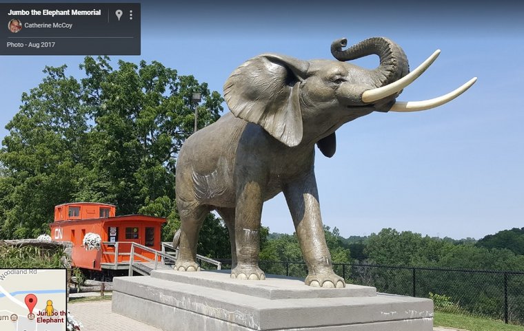
And that’s a good story of Jumbo told by his handler. You know, it’s only in relatively recent years people are beginning to realize elephants are a lot more intelligent than they’ve been given credit for. Amazing animals.
Then again, most wild animals are more intelligent than people realize.
Soeaking of amazing, I’m still astounded at the things Mike comes up with. I hope somebody is taking notice and that sombody should realize Mikes “exile” is a loss to us all!
Canadian National introduced the ‘wet noodle’ in 1960, the last year they ran mainline steam. CN still had a fair number of wood cabooses in everyday use during the 1960’s and later, and many of them were repainted into that CN scheme.
I notice on this caboose, the herald and reporting marks are mounted on separate pieces attached to the car, rather than just painted on as would normally be the case. I wonder if that was done as part of the restoration, so that the car could easily be adjusted / backdated at some point in the future?
They did, and haven’t changed it in nearly 60 years now. The CN noodle has become a classic logo in its own right, and is a classic story in corporate marketing and industrial design.
What you say is true 'Dude, can’t argue with it, but compare the “noodle” with the classic herald on the caboose in Miningman’s post of April 5th.
Which one would you rather see, or have?
You see, I remember back in 1970 or so when a lot of American corporations updated logos they’d had since the 1920’s-1930’s to ones that were more sleek and modern. It was a PR disaster! The public hated them! The then-existing Bell Telephone System’s new “Bell” logo was compared to a Nazi helmet, for example.
Most, if not all, very quietly reverted to the old logos.
Of course, if the CN “noodle” is all most people remember it’s another matter, but still…
Even as a kid I saw that the route between the end of the C and far top of the N was nor served well by going all over the place like that and that it was a straight line and much shorter route. So I thought ’ maybe there’s a mountain or a lake in the way, but there couldn’t be that many mountains and lakes’.
I loved the green and gold and the Maple Leaf ’ Serves all Canada’. That held up well especially on passenger cars and were very iconic and spoke of railroads.
Imagine if the Union Pacific went the wormy route and abandoned tradition and colours. Went all moderernized marketing wise. Thankfully they resisted all that pressure to do so and are perhaps the only one to stick with it.
Strangely enough I did like the CPR’s multimark. Probably because of the colour coding on freight cars and applying it to everything, hotels, ships, trucks, communications, planes, you name it. Orange is beautiful, used to sing it all day long.
Even they have seen the light and reverted somewhat to the Beaver even if it dosent show all that well. There is hope.
The www on CN locomotives is ridiculous. We know, we know, we got it, a long time ago. Embarrassing really. 60 years now and still don’t like the noodle. A pox on the noodle. Feh, bletch, pzzzz.
You know, some things you change some things you don’t. Most people like a constant, some thing that’s a “rock in the whirlpool” they can hold onto in a rapidly changing, confusing world. It can be anything from a corporate logo of a brand (of anything) you like to that burger and ice cream place you went to as a kid and, God be praised, is STILL there when you go home to your old stompin’ grounds.
“Progress is change, but change isn’t always progress.”
Imagine Santa Claus re-imaged into a clean-shaven Dockers-wearing urbanite who uses Amazon for deliveries instead of the sleigh. Or instead of a sleigh he uses an ATV and his bags are made by Gucci. See where I’m coming from?
Don’t worry about Santa, he could buy and sell Bezos ten times over.
I have it on best authority, my grandmother went to school with him!
And she NEVER would have lied to me about something that important! [;)]
My God, don’t even THINK about UP without a steam program! But of course, the scary thing is, it could happen, it all depends who’s fanny is in the CEO’s seat.
Probably won’t happen though, UP’s been around since 1862 and still going strong, there aren’t many companies here in the US that can say as much. UP’s proud of that, and steam’s part of the heritage.
The link to CN logo evolution says CN’s second hundredth anniversary is coming up exactly 75 years after D-Day.
1919: Canadian National Railways
The name “Canadian National Railways” first appeared officially on December 20, 1918, when the Government authorised that term as a descriptive name for the various properties that made up Canadian Government Railways — principally, Canadian Northern, National Transcontinental and Intercolonial.
Six months later, on June 6, 1919, Parliament passed legislation to incorporate the Canadian National Railway Company Limited — and CN was born. The following year, the Grand Trunk Pacific was added to the line-up, giving the new railroad two transcontinental networks.


/https://www.thestar.com/content/dam/thestar/news/insight/2014/03/07/jumbo_the_elephant_from_child_star_to_boozedup_wreck/death_of_jumbo.jpg)


