How many of the younger fans realize that most of a railroad’s locomotives didn’t carry the “heritage” paint scheme in real life? Think about it–most HUs are painted in First Generation passenger colors. Passenger trains were but a small part of the overall fleet. Even some of the later roads’ schemes weren’t the majority. Other than factory-new units, how many PC units actually wore the full scheme?
(I’m hoping that this is a safe topic, but who knows anymore.)
PS Under full disclosure rules, the only HU unit I’ve ever seen was the CSX NYC locomotive on Sand Patch last year. I didn’t even get a little tingle when I saw it. ![]()
![]()
I got a big tingle when I saw the NS Wabash unit parked on the BNSF siding behind our house. I grew up in a town that was 4 miles from the Wabash.
You win. When I posted this in the morning, I emailed a fellow member of the GD-MF-AH Club how long it would take for my innocuous thread to turn argumentative. Even I didn’t think it would be the first response.
It seemed like all of 5he New Haven FL-9s ended up inOPC paint, some black and more in a later blue and yellow scheme. I think the state paid for repainting in the later scheme. Ironically, Connecticut painted their newly bought locomotives in the New Haven scheme until they unveiled the CT rail scheme, and even that mirrors the New Haven colors.
Oh, good, a paint scheme discussion. Finally, some really interesting stuff to talk about instead of rambling on about passenger rail for the umpteenth time. I agree, on many railroads, the freight scheme was more common than the passenger scheme yet the passenger scheme is the most publicized, especially in heritage units.
Any ‘heritage unit’ PC scheme has been the general crappy dip black and mating worms. I don’t think I have seen one with the two-color herald, which was an awful thing esthetically. I think there is a locomotive in the first-generation MNCR colors (blue and yellow) which was an upgrade from the dip.
I don’t see anything wrong with picking the most attractive ‘legacy’ schemes: it’s a celebration of perceived heritage, not historical corner-cutting or malaise. The problem with PC was that they never knew anything but optimizing malaise…
The current MNCR locomotives in NYC lightning stripe and NYNH&H (pre-Matter scheme) are extraordinary.
Now if only we could get rid of the tendency to make ‘theme’ units funny-looking, something I call the ‘We Are The World’ approach to attractive graphic design…
We need CSX or NS to paint a heritage NYC unit in jade green like this E8:
Love the Jade NYC, lets see some green and black GTW too. The GTW had six streamlined olive green 4-8-4s designated class U-4-b,
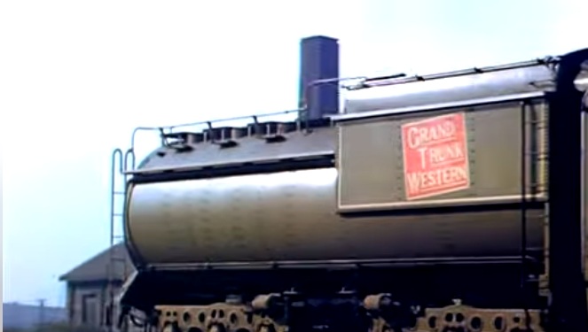
I use to think the U-4-bs were not as pretty as other stream lined steamers, now I think they are more rugged and handsome looking then the PRRs or NYC stream liners
I agree–just because it doesn’t represent the majority of the fleet doesn’t mean that it’s bad. The Penn Central does have a less-than-attractive scheme. Though, to be honest, a big consist of large road switchers all in black is a rather impressive sight.
Having lived through that era, I came to love dull grimy black just as much on various uncommon diesel-electrics as I do on working steam locomotives.
For true depression, you need a scheme that combines the dip black with some moldy color that screams ‘too much rain and too little attention’ … and that was Burlington Northern for far too long.
Conversely, there wasn’t an awful, gray day in some godforsaken Appalachian holler that wasn’t lit up when Chessie System units arrived, whether you liked going to the circus or not.
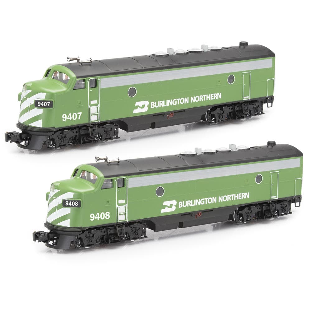
It’s the scheme applied to hood units. Cascade or whatever that weathered-to-pond-scum color it became halfway down the hood, and dip black everywhere else. Instant depression even on a bright day.
Milwaukee did much the same thing with orange, and it was spectacular.
I always liked the Cascade green since it reminded me of the mountains and forests of the PNW. Now, the two tone greens of the old GN, I could do without.
There aren’t really any color schemes that I don’t like. The only is patched units after a merger, if they aren’t well done, which they normally aren’t.
How much dirt is to be mixed with paint to accurately recreate Penn Central’s visible identity?
Not so much ‘dirt’ in the weathering sense (which is mostly light tan and looks like road dust) but oily film and grime.
And cheap paint etched dull and chalking under it.
Then you need the 105-facet polygonal wheels of the old patent, plus some servo system, cams maybe, or mercury with a small pump, to simulate harmonic rock. Special ‘mega’ edition for Hi-Ad Alcos.
Why haven’t companies like ESU done DCC ‘sound sets’ and effects for Penn Central, like better versions of that Lionel road-failing F unit. You could have prototypical asthmatic coughing and blower whine when starting (with appropriate white smoke effect); you could mimick the hammer of cracked exhaust manifolds; you could reproduce the crackle and periodic fiery crumble of ancient worn brushes. Not to mention ACTUAL cab chatter (perhaps from Mike Bednar and friends if not directly from PC employees) that reflects the true character of the experience of much of the Northeastern railroading in that era.
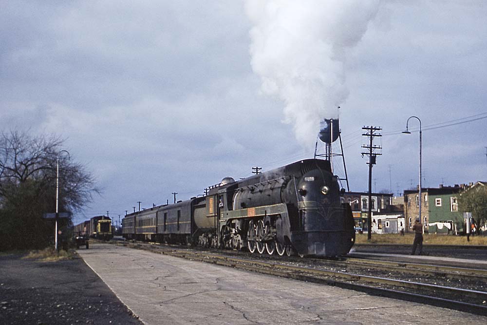
Did the NYC really ever paint a locomotive this color? I find it hard to believe.
Yes, but only 3 of them. Google “NYC jade green e8” and you will get an AI summary, plus many links to various trainorders of Facebook pages. Here is a photo from 1961 in Detroit:
1 Like
Was it black or was in Brunswick green?
There were a few PC EMD SW1’s in Detroit that had a very dark greenish tinge in the right light.