I am starting work on the Walthers Interstate Fuel & Oil kit and would appreciate some advice on color schemes for the various parts of the kit- the vertical & horizontal tanks, the office, the pumping facilities and piping. My layout timeframe is 1950s-early 1960s (generic). Please help me with names/color numbers of specific colors (and from which mfr.). The kit box cover is not very helpful, and I have come across only black & white real world images so far in my research. Thanks in advance for any feedback.
Generally the tanks would be either white or silver. Some of the piping was color-coded to help show which kind of fuel was coming thru which pipe.
The office could be just about anything. The roof could be black, or silvery unpainted metal. The sides could be about anything. I ended using the office from my kit for a different company on the layout, and painted it tuscan red with a gray/silver roof and gray windows. I guess it would depend too on whether you’re modelling it for a specific company, like Shell yellow, Gulf orange, or Sinclair green.
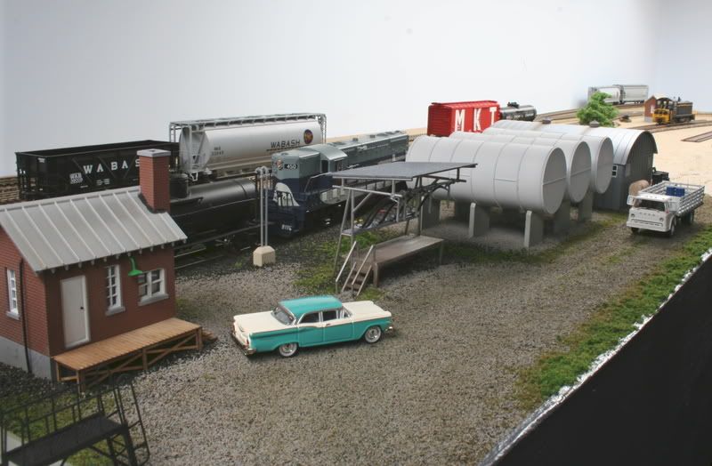
Here is what I did with mine. I added a bit of weathering after this picture was taken.

Hi: I split that kit and used the tanks with one kit, and the quonset hut/office with another. The tanks were painted with Polyscale flat aluminum and weathered with Bar Mills black powder. The quonset hut was also painted with flat aluminum/tuscan red trim.


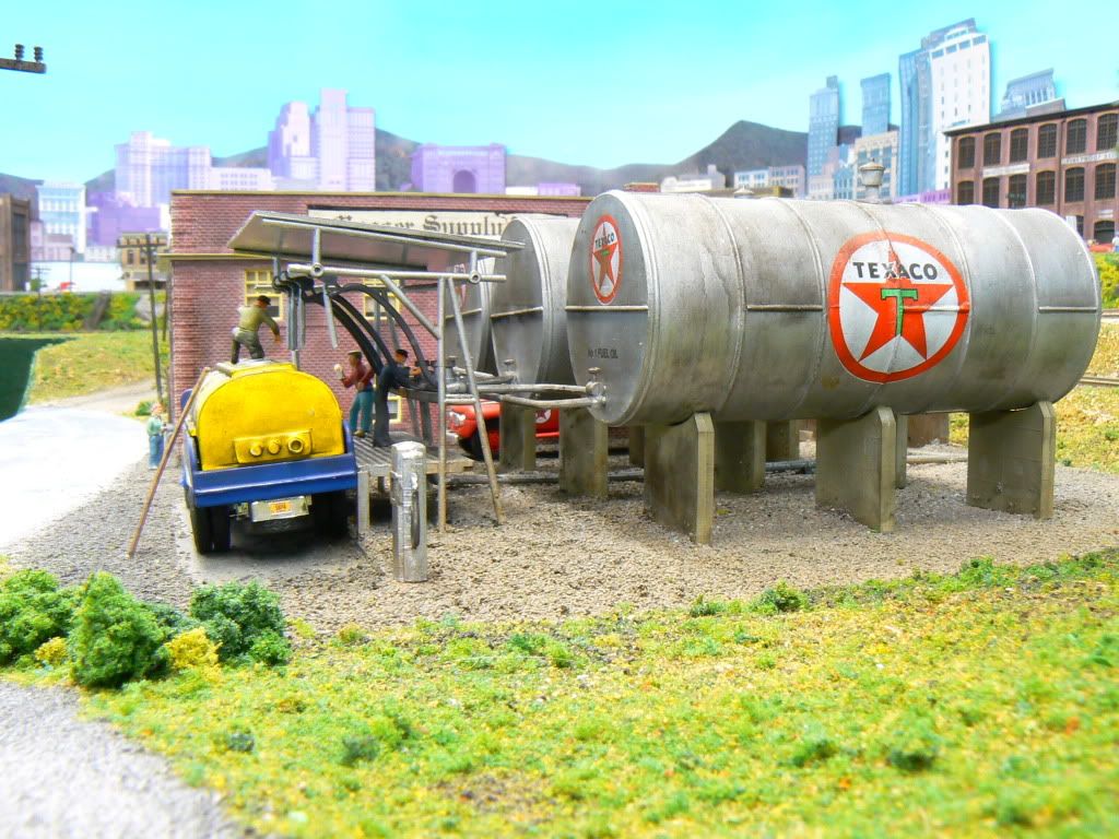
Here’s another way of doing it.


Hi!
The major oil companies are extremely strict on graphics, colors, and signage and have been so since the early days of the 1920s-30s. Insofar as colors and other standards, this was not such a big deal in the early years, but got so in the postwar (WWII) years. The one major exception was signage however.
In example, Mobil Oil published very thick manuals with their demands for stations, terminals, refineries, vehicles, and even offices. One of the very big deals was that after a certain date, any representation of the Pegasus horse had to show it with the horse’s head level, rather than on an upward slope. Mobil was very fond of “Mobil” beige, grey, blue, and red and had very specific formulations. I believe Valspar was a major supplier for paints in the US.
All that being said, IMHO, if you are modeling the early '60s or earlier, the main thing to concentrate on is the signage, and thankfully there are a lot of decal sets out there that are available.
For what its worth,
Mobilman44
PS: I too have built the kit in question and combined it with several more tanks. It really is a good representation of a small town terminal in Postwar years, and Cornerstone did a nice job on it.
Of course if you’re modelling a free-lance local company that rec’d oil products you could use any colors you felt appropriate. It wouldn’t have to be gasoline either, it could a company that got home heating oil by the tank car for example.