This is my first post to the forums so go easy on me!
I know this is probably a loaded question…but here goes anyway.
What color blue does everyone use to paint the sky in their backdrops? I dont want to end up with something that looks cartoonish, so I would imagine erring on the lighter side may be my best bet. I just ordered some of the Radical Flats from King Mills and need to get some color up first.
When exploring a sky color for my backdrops I followed a suggestion that I gather some paint swatches from the paint store, go outside on a clear day and choose the one that most resembled the sky and then go with one shade darker. Also enlisted my wife’s eye for color as mine is lacking. My layout is lighted with 4100K florescent tubes and it was also suggested that going the one shade darker would improve the looks of the backdrop in photographs.
Peter’s got some great tips there. I agree that one shade darker would make it look less smoggy. Looks like a typical Midwest summer’s day, though, if that’s the desired effect.
Another way to think of it is as a base color when looking high into the sky on a clear day, with increasing overlays of white as you look down to the horizon, which may be hazy on even a relatively clear day.
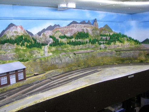
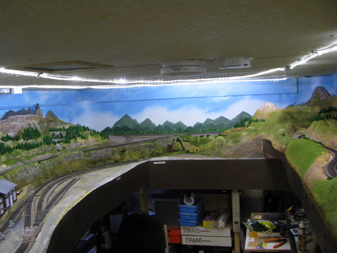
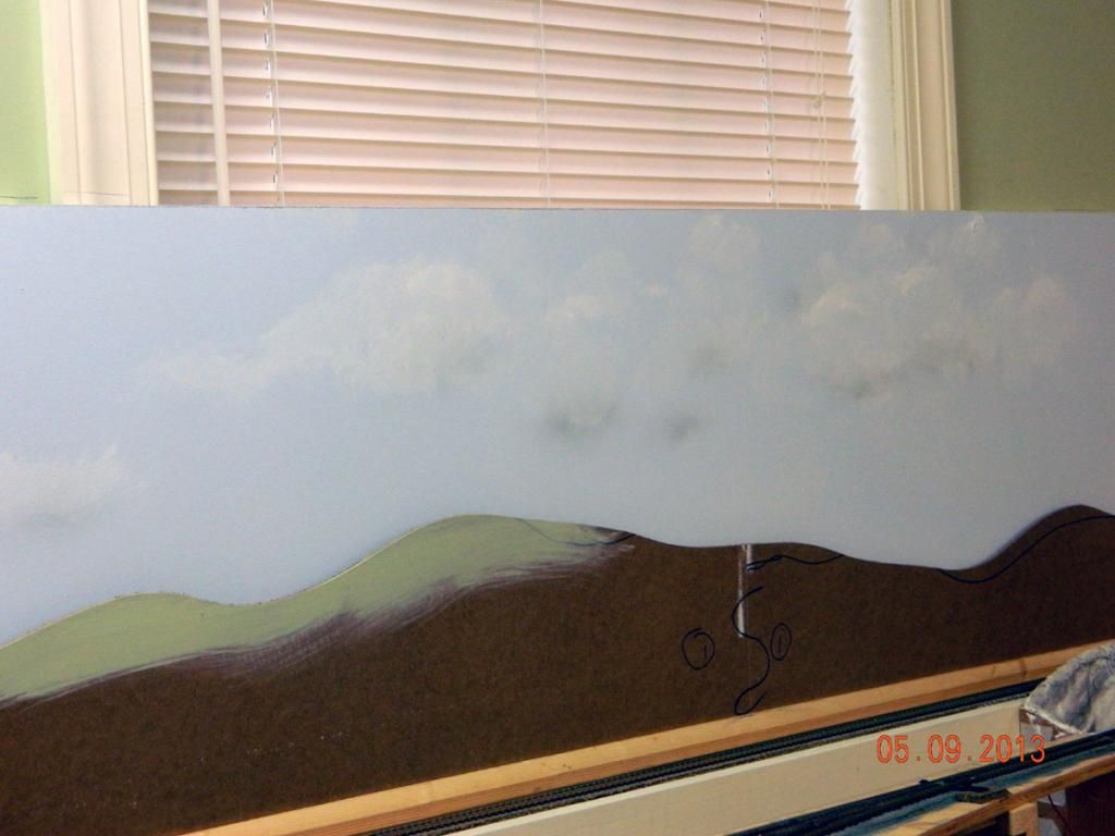
For my example, keeping that in mind, the pic below on my Cascade Branch is of a sky mostly shot with Krylon Island Splash Satin spraybomb. It’s about as dark/bright a blue as will look natural up in the mountains. But you can see where it’s been oversprayed with flat white to varying degrees, depending on whether I want a cloud or just a little haze.
keep in mind that most paint shops can scan a color sample from almost anything (hi rez is better than 72dpi, if you print from the internet)) these days and mix paint to that spec.
I actually use 3 colors of blue. The exact color isn’t critical and will vary depending on paint brand. In general, select a dark blue, a medium blue, and a light blue. You will apply the dark blue at the top, the medium blue in the middle, and the light blue at the bottom. I use latex paint which is formulated to dry quickly (because most people want to paint two coats in one day). We don’t want the paint to dry this fast when painting the backdrop. As such, I add an “Extender” which retards the drying time to allow you to work with and blend it. This blending is critical because you want a gradual transition of color from dark to light on the distant horizon. I work with about 3-4 feet in length at a time. That ensures the paint remains wet for blending. I use four 2.5” wide trim brushes. One dedicated to each color of blue, and the fourth for the blending.
Let’s assume your backdrop is 30” high. Starting at the top of the backdrop, paint a 1 to 2” wide stripe of dark blue. About a foot below that, paint a width of the medium blue. Using the blending brush, work the dark blue down and the medium blue up mixing the colors where they meet. With practice, you will achieve a gradual transition from the dark blue into the medium blue creating custom shades between. While this mixture is still wet, I add the light blue to the lower portion of the backdrop. Again, using the blending brush, work the light blue up into the medium blue and the medium blue down into the light blue. This will give the effect of dark blue sky immediately overhead and light blue on the horizon.
I have zero artistic talent, so if I can pull this off, anyone can. I just completed all the backdrop for a friends layout using this technique. It took me a total of 12 hours to do his entire layout. I’ve also used this on my home layout with equally good results. Good luck, Tom
Which ever blue is in the local building supply store mis-tint section for a couple bucks.
Bottom line is it doesn’t matter. The real sky varies with the weather conditions from almost white, to pretty dark blue, grey, and even funny green tint(watch out for a tornado in Kansas).
I used a color from Wal Mart’s Color place called “Song Blue Sonata.”
I lightened it toward the horizon later by brushing white drywall primer onto it, gradually feathering this back into full-strength blue as I moved higher.
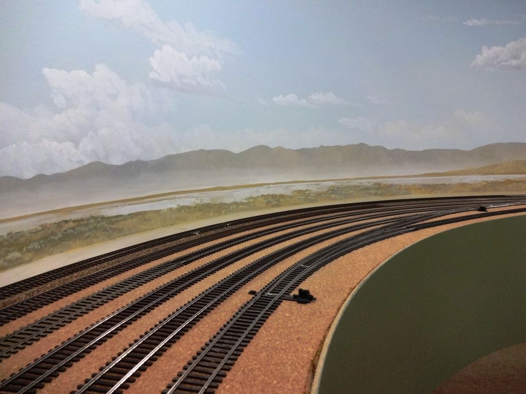
Here’s an area with fewer clouds to give an idea of the basic color.
Because I use the Walthers background scenes, I use the same color of blue they do. That way when I cut the sky part off of them, if there is any sky in the details that I can’t cut off, the color is the same. Particularlly on the scenes with trees.
I use flat latex wall paint in white – whatever is cheapest at Home Depot this week – to paint the panel (I’ve used foamcore, styrofoam beadboard, foam insulating panels, and 1/8" hardboard to make them) from top to bottom. Then starting at the top, Iuse and airbrush loaded with Vallejo Acrylics Model Air Sky Blue and work my way from the top to the bottom, applyng less pant with every pass as I work down the board. This creates a sky which is almost totally blue at the top and almost totally white at the bottom (at the horizon).
I think you’ve got it perfect. I like the use of subtle shading with light and dark, like the whiter blue near the edge of the green building on the right. It looks like a suggestion of humidity in the air.
I painted the walls and ceiling of my railroad room with Valspar July Sky from Lowe’s. French Country Blue by Glidden is another good midsummer sky blue.
Mike and Doughless, thanks for the positive comments.
Like Tom, I added an “extender” called Floetrol to both the blue and white to allow more working time, helps with blending while softening the roller and brush marks. Blue was quickly rolled on and while still wet brushed on some white for the horizon, then randomly brush streaked alittle more white higher up for some wispiness.
BTW, Blue is Sherwin Williams Acrylic Latex 6786 Cloudless
A friend of mine is a painter and his suggestion was to vist Lowes and Home depot for the paint that people didn’t like and retuned it. I found 3 gallons of blue paint that was 25.00 a gallon for 5.00 a gallon in three shades of blue and with a little mixing in a 5 gallon bucket I got the color I wanted.I still visit them and find other colors to use by mixing them, just my way of saving for the other needs of the layout. jim.
I went to Lowes and looked thought their paint palette cards and picked a sky blue that looked about right to me vs. the sky well above the horizon but not looking straight up. From memory it was Glidden “Clear Blue Sky”.
If you walk out side on a clear day and look at the sky at various points and you will see how it is. Look straight up and you’ll see the deepest blue. Down near the horizon it is a much paler lighter blue, and depending on atmospheric conditions, haze etc. that will modify the blue you see.
In general, you want a lighter hazier blue down near the horizon. Probably a good compromize for backdrops is to go with a light to mid sky blue, which also depends on the area you model somewhat, and then you can add clouds or haze above the horizon. In general you start lightest at the bottom and get deeper blue as you go up toward the zenith. This is all something you can observe by stepping outside and looking at how the real sky looks under the conditions you are looking to model and then extrapolating that to your backdrop. Since most back trops are in the range of 16 inches to maybe 36 inches max, you are going to want to go on the lighter side of blue as the is the case with the sky. Thats my 2 cents worth from observation.