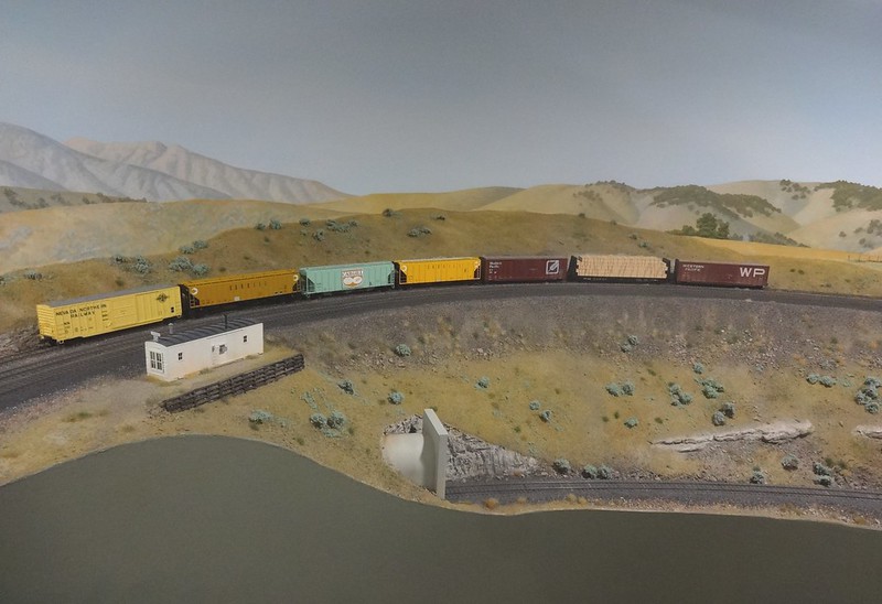
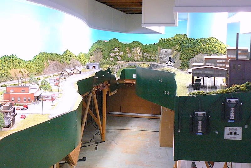
It is about that time for me to paint my facia and would like so see some examples and opinions as to why that color was chosen.
I wanted a shadow box effect and earth tone, so went with dark brown for the facia and valance. The facia isn’t as dark as it appears in the photo.
Regards, Peter


My reasons…
I like green.
The color works well with the general overall scenery palette for the prototype.
Green looks dignified.
Green looks official.
That said. I would prefer a different shade, a bit darker, if I were granted a do-over…
My facia and valence are black as is the ceiling over the aisle. The walls are a dark green.
Why black ? Well, the facia isn’t part of the scenery, so I don’t want to see it. Black makes it disappear.

Mark.
I have to vote for the dark facias. It focuses the eye on the scene. However, I would have to have some lighting where the control panels and other facia related details are. I don’t seem to do too well in the dark.
Dave
Mark’s comments brought something else to mind about why green works well for me. Green is a lot like black once you start ignoring it. Sometimes with a fascia, it’s got to be right in the middle of things, so black may be too severe. My layout is a no-lix design, although there is a part that is doubledecked. The advantage of green is that it blends in better with the foilage that surrounds it under these circumstances than black would. So double-decking and such might change your calculus, where you hjave sceenry both above and below the fascia.
I like green because it blends with the scenery and unlike black,green is warm to the eyes…
In the past at the club we’ve used a dark brown, changed to matt black and, at the last when I was still involved, changed to a satin black, as it didn’t show up hand marks as much when handling the portable modules.
In theory, the colour shouldn’t really matter, as long as with any good “frame” the eye is led to the subject, which is also enhanced.
Cheers, the Bear.
I read some years ago that the eyes is like a camera lens,they focus on the main subject while overlooking the details of the scene.
If Your modeling skills are’nt that great…you paint your facia ‘‘pink’’ [:-^]
Mines semi gloss black, like the control panels with white track diagrams on them.
Take Care! [:D]
Frank
My home and club layout facias are Hunter Green because we believe people look at the layout instead of the facia if it’s a dark color. Too bright a color detracts from the layout.
I’m with Mike and Larry on the dark green. Not sure exactly what color… it was something someone had mixed a t Home Depot and then not taken, so I picked it up for a song ($5 for a gallon of Behr interior flat latex, IIRC). It looks like Mikes, although perhaps a little darker.
I stain and polyurethane the benchwork wood, using “Early American” stain. I use 2-inch foam, set behind the front face 1 inch deep, so that there’s an inch above the benchwork. Then I round off the edge so the scenery “rolls” into the front face of the benchwork.

I mount my control panels below the benchwork. I use white “shower liner” plastic-coated hardboard for the panels, framed with wood. The panel frames mount to the back side of the benchwork with screws for easy removal.
Me too. Hunter Green. Why? Because. [(-D]
Rich
I used Sherwin Williams, Grays Harbor #6236 in Satin finish. This is a darker than medium gray color. Gray is a neutral and blends with everything so you don’t hardly look at it except for diagrams and toggels but yet the edges are a finished product. Doug
I paint mine black. But forrest green looks good too.
I went with British Racing Green (which is a similar shade to Forrest Green) in Semi Gloss.
I am able to attach my Town Signs - Industry Signs etc with Double Faced Tape and still able to remove them if I need to change the sign!
As I am doing Western Pa - with lots of Green Trees - The Green Fascia compliments the Green Trees and seems to carry the Western PA Green look to the edge of the Layout!
BOB H - Clarion, PA
I like using a color that picks up something out of the scenery, usually something dark.

My current layout uses a sagebrush green.
Dark green for me, it complements the scenery.

I had always assumed I favored very dark fascia colors, such as black or the dark “CTC panel” green that seems so popular now, but in photos and videos the light neutral gray of Jack Burgess’s Yosemite Valley layout seems totally unobtrusive and very effective. I no longer recall the western themed layout that used a sandy beige for its fascia and it too was unobtrusive and effective and a light color. Tony Koester published an article on fascia styles and colors in MRP some years ago which is where I think I saw that beige fascia. If I recall right their theory was that a layout without trees should not have a green fascia.
By contrast I have found the red fascia used by the Model Railroader staff on their Wisconsin & Southern adjunct to the MR&T to be utterly distracting. I had read of modelers who have more than one prototype on their layout and used fascia colors to indicate this, and I assume that is what the MR fellows were trying out on their WSOR layout, but perhaps that is a better theory than practice. I had briefly toyed with a layout that would feature a C&NW and Milwaukee Road interchange, and thought that orange+black and yellow+green fascias would make plain to visitors and operators whose track was whose. Seeing the red WSOR fascia photos convinced me that was not a good idea, and the layout idea never came to fruition anyway.
The take away is that perhaps the distinction is not really between dark and light colors but rather to prefer tones and shades that are calming and neutral and avoid grabbing the eye such as primary colors --and absolute white – tend to do. Rule of thumb: if it is a color used on national flags, banners at auto dealers, or children’s cereal boxes, avoid it for fascias. If it is used for doctor’s office waiting room furniture, military vehicles, and business computer cases, it is probably OK.