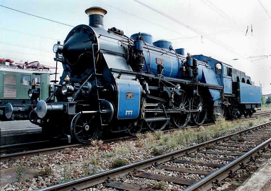
…The blasting K-4’s approaching, certainly do not have a “clean look”, but to my eyes, they certainly “mean business” in appearance. Rough looking, but with geometric balance in appearance satisfy my eye as a “working” steam locomotive meaning we’re doing the job…
But…Surely, that fireman might do better with less of the black, dirty smoke…
Decoration as in Britain , especially before forming of the Big Four , was an extreme and for sure it could not be continued in more modern times , this is why BR standard color scheme was substantially simplified , with exception of some locomotives turned out in some quite elaborate striping and - most contrasting with American and also with German practice - in highly polished finish of paint ( or should I call it lacquer in this instance )
When in England , I saw some engines in the Railway Museum at York in downright fascinanting color schemes , finish and decoration by line-out and emblems . I must say it was impressive and it looked artistic and gave the engines a distinct dignity of their own . The best German steam loco restoration can come up with is traditional black & red scheme in bright red and sparkling glossy black - I’ve seen some engines in that ‘fashion’ and I feel it still looks great on most classes , best on the 41 Mikado and the Decapod classes , it tends to become a bit much on Pacifics - too much red to balance out with black . However , detailed finish is never up to the level I saw in Britain .
Still , to me a steam locomotive in regular traffic , kept in decently clean condition looked much more professional than one covered beneath a layer of cinders mixed with soot , abrasive brake block wear , traces of leakage of treated feed water running down boiler sides , traces of blow-by steam from leaking cylinder glands on cross head ( steam of treated water mixing with leakesd oil makes for a gray-green slime - eeehk! ) , drive gear and wheels covered with an oily compound of road dirt , abrasive brake shoe wear , cinders and what have you , completed with rusty areas on the running board and on tender tank top , rusty pipes connections , diverse leaks of steam , water and oil , also dirty cab , extra dirty cab floor , lots of lumps of coal of all sizes from fist size down to gravel in all corners of
IMHO, maintenance and aesthetics are birds of the same feather. Even without a sleek design and/ or an elaborate paint job and lining, a locomotive looks “good” when it is well maintained and kept.
I still have memories of the early 1960, when steam was very much present on German rails. In those days, locos were assigned to specific crews, who kept their “work place” in top shop. At stations, you could watch the fireman climbing out of the cab with an oily rag, to wipe and swipe down any water stain on the boiler. That changed in the late 1960, when the demise of steam could be foreseen. Locos did not have a specific crew any longer and it did not take long for them to get that sad look of neglect.
Post-war Deutsche Reichsbahn in East Germany marked locos with a special signed, stating they were “in personal care”
I suppose the “last gasp” of trainmen being assigned locomotives was on the Erie Railroad’s Northern New Jersey commuter service. The Erie singled out engineers and firemen who kept their locomotives “lookin’ sharp” with the “Order of the Red Spot”, meaning the number disc on the smoke box would be done with a red background as opposed to the usual black.
Wish I had the skill to post pictures, it’s a minor miracle I can use a computer at all, but the Erie K-1 Pacifics in commuter service were classic! Russia Iron boiler jackets, probably the last on American railroads, polished brasswork, red cab windows, polished rods, really 19th Century anacronisms when you think about it. Ah, the old “Weary Erie”.
They certainly were, the pride of the company really showed on those engines. Thank God and the efforts of Graham Claytor one survives today in the Smithsonian Institution. Sadly, it’ll never run again, but I guess life “stuffed and mounted” beats no life at all.
Hi Juniatha, and thanks for posting that Erie Pacific picture for me! Sorry I couldn’t get it any sharper, but I think everyone’ll get the idea of what I was talking about. Between you and I, I think the Erie’s “K” class Pacifics were MUCH more attractive than that “other railroads” K class!
Well - my own idea of harmonious looks is more about a steam locomotive basically having one uniform color from front to back end over smokebox , boiler , cab and tender tank . On that basis , there may be various dress-ups , say contrasting lining of running board , preferably not simply ending at board’s back end to leave the rest in dire dullness but continued over the tender in a way both emphasizing proportions ( a little ‘cheating’ to improve them and make tender tank appear less bulky should be allowed ) and visually embracing both parts of the locomotive into one unit .
Further , a second color for vehicle part of locomotive ( colloquially area ‘below running board’ / below tender tank ) may be used to highlight these dynamic components of the engine in contrast to visually more static energy generating components . Some people also like white bands on wheel tires - however with tender bogies and in US engines generally also trailing delta trucks having outside frames , this line-out tends to fade away along the side towards the back and thus tends to create a diverting rather than combining effect , an effect like engine ‘having wheels on the forward part and somehow undefined means of gliding in the rear part’ , or so it seems . The higher powered wheels are , the less contrasting the two colors for ‘upper’ and ‘lower’ areas should be or again there will be a tendency to unbalance forward to rear parts of locomotive since , inevitably , a bright color spread over visually half the area around drive will contrast with somewhat suppressed looks at the tender . Freight locomotives were better suited for contrasting two-tone schemes since vertical proportions of powered wheels to tender bogie were closer together .
Also , I find locomotive designs featuring an especially smoothened exte
I am afraid I have to admit, that the K-5 in “Reichsbahn” guise looks a little odd to me. Somehow, the feed water heater on the smokebox top looks a little more out of the way, than in the second picture. This may only be due to me being used to the classic look of German steam locos in their black and red appearance.
Interesting, interesting, your treatment of a NYC K-5. The slicking up of the top of the boiler, the moving of the sand and steam domes does affect the looks of the engine positively. The red running gear, and I know the Reichsbahn used red for very good and practical reasons, does seem a bit out of place on an American engine. Of couse, if the NYC or other roads had used red all along none of us here would think twice about it. Honestly, I like the blue treatment of the running gear a lot better. The Blue Mountain and Northern Railroad in Pennsylvania has a “pet” steam locomotive done up in a blue paint scheme with pinstriping on the drivers, kind of looks a lot like the Jersey Centrals “Blue Comet” engines of the late 1920’s. You can see it on the Blue Mountains website, and also in action on PennRail Videos website. Just a gorgeous engine!
In a way, I guess I’m kind of 19th Century in my taste for locomotive finishes. Back then the locomotive builders tried to outdo each other in how spectacularly they could finish the engines. But then around 1875 or so the New York Central said “Enough! Just do ours in black, it’s easier to take care of!” And not too much later most other roads followed suit.
By the way, the Erie had a K-5 Pacific as well, basically the USRA Heavy Pacific. Not as sleek as your K-5, but very rugged looking and businesslike. The K-5 is where Erie’s passenger steam developement stopped, they never went on to say a Hudson or Northern type, didn’t see the need
I’m going to e-mail you a picture of a “steam locomotive” with a paint scheme that’ll make your blood run cold! You should here Lady firestorm whenever she sees it!
I wonder if you’re NYC K-5 Pacific would have met the NYC clearance limits for height? The NYC’s clearance diagram wasn’t quite as generous as say the VGN’s.
The red paint treatment looks a bit odd to my eyes that have been programmed on typical American paint schemes. What could be worse would be applying the Espee’s bloody nose paint scheme to a steamer, in contrast to the Daylight scheme looking very nice on a diesel.
Meet the loading gauge ? sure , why not , I didn’t change anything as concerns height , I just repositioned horizontally on the longitudinal center line . The color may be bright yet it doesn’t enlarge wheels an inch .
Yes , the NYC loading gauge was very little higher than the Austrian , Hungarian loading gauge , also DB profile II , which was 4650 x 3200 mm , the NYC was some 4680 mm high , don’t know the width over cylinders but that was pretty tight , too , possibly even tighter than the European profile mentioned . British Railways profile was so narrow in the lower part up to platform height it demanded cylinders of more powerful two cylinder engines to be slanted . Churchward’s four cylinder 4-6-0 Kings and Castles were so sleek they passed without slanting - in contrast with the bulging figure of their engineering patron .
Uhm , with engines having plain bearings and consequentially having oil spill ( lesser with grease lubrication ) brightness did progressively fade away into darker shades with miles accumulating - so , in practical service it would have been half as spectacular , you may as well spare your indignation - g
Actually I wonder Coke red on steam wheels makes a couple of Americans shy - it’s pretty much the color of the stripes in our national flag and with white linings too . Ok , I could make the black part dark blue , then it would be stars & stripes theme and who would want to go “oooh” and “argh!” about that ? Oh , by the way , I have a picture of the 4449 in stars & stripes colors , on the bicentennial train in 1976 . My father once mentioned he had missed it because I was being born just then , he smiled - when he told me .
I’ll third the comment about the beautiful picture of flowers.
As far as the colors schemes for steam locomotives, the black with white and/or silver trim is so ingrained the American railfan.s psyche, that any deviation for a non-streamlined locomotive looks odd - much the same way that European style couplers would look odd on an American locomotive. The prejudice against fancy color schemes is less pronounced for streamlined steam, given the reaction to the Milwaukee A’s and F-6’s, the Espee GS-3 to GS-6 series and a few others.
As far as loading gauge… Huddleston’s book on the C&O class H-8 pointed out that the larger loading gauge of the C&O allowed for normal height for the domes as compared to the UP Big Boy that had to use short domes to keep within UP’s loading gauge (the Big Boy was several inchs shorter in height than the H-8). It was a bit odd to see that the GS-4 was barely lower than the H-8 in spite of the Espee having some tight clearances (mostly on the Siskiyou line and NWP).
I am not really good at handling Photoshop, so I will have to rely on “real” photographs for my comments.
I am having difficulties in developing a taste for non-real paint schemes at steam locomotives. While I like those mainly maroon or green paint jobs on British steamers, i find the looks of them applied to a German steam locomotive odd. Again, I grew up with those black and red standard Deutsche Bundesbahn liveries.
The DR 18 201Pacific sported a number of different colors over recent years. 18 201 was rebuilt from a streamlined 4-6-4 T loco built to haul the “high speed” train from Berlin to Dresden in the 1930´s. With a speed in excess of 160 kph, it was the fastest loco on post-war Reichsbahn tracks, maintained for testing passengers cars to be exported. I am not sure, but the originally had the usual black & red livery.
At a later date, the loco received a green and red paint job:
For some time, she sported a red color:
I can´t explain why, but I don´t like either one.
I feel fine with this paint job, applied to the ex Royal Bavarian State Railway class S3/6, because it closely matches the original coloring:
Marklin once sponsored a paint job in “royal blue”, making the loco look like this:
Guess which one I don´t like!
A coke red, non, streamlined steamer - I have doubts I´d fancy that!
Beautiful Pictures, Sir Madog. A while back I bought a tarnished brass PRR K-5. I decided to do some research before I painted it and came across a rather “colorful” set of instructions for what I had assumed would be a rather simple job: A properly turned out K-5 featured Engine Black for the pilot and everything below the walkways, Brunswick Green for the boiler, domes, cab and tender body, Dark Graphite for the somkebox ( referred to as “front end paint” in the instructions ). Cab roof and tender deck were Oxide Red, firebox sides were Dark Graphite, cab window sashes and keystone number plate were Tuliodine Red and tender chasis and trucks were Engine Black. Pretty “colorful” for PRR practice, wouldn’t you say?
Well , yes and no : basically it’s the old Brunswick & Black theme the PRR continued via GG1 up ( or down ) to the T1 class - we had covered that point some pages before when I posted a variety of T1 color schemes and again green won ‘brush down’ .
What on rails the Pennsy meant with a red roof and tender deck I have no clue - after all the cab roof was not exactly designed for a ride on the wild side . Smokebox and firebox sides off-set in graphite again was fully traditional , as my dad had told me , it stemmed from times when paint was oil- based and not suited for high surface temperatures .